
How to represent data in Power BI from REST APIs?
Microsoft Power BI, which already we talked about in the past, is a data visualization and analysis tool that allows you to create visualizations easily, using data sources such as CSV, databases and even Rest APIs.
In today’s article we will discuss the following points:
- How to use a REST API as a data source for importing JSON data into Power BI
- How to transform JSON data into a tabular format.
- How to make a visualization using the imported data.
Step 1: Install Power BI
The first thing to do is to install Power BI. We will use the Power BI Desktop version, which is free and will allow us to create visualizations in a desktop environment (without publishing to the web, come on).
Step 2: identify the REST API from which I will fetch the data
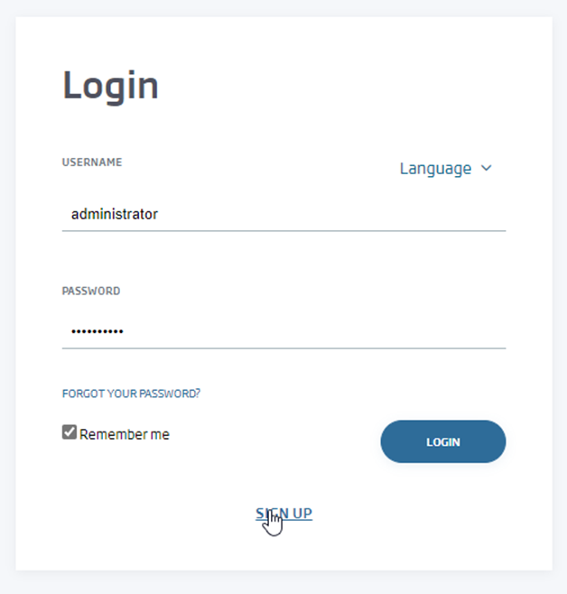
Without data we are not going to be able to do anything, so we are going to use a public API from Onesait Platform’s CloudLab environment.
If we do not have an account yet, we can create a user from the SIGN UP option:
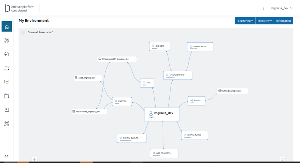
Once inside, we can access our environment in which, if I have not created any element of the Platform, we will see an initial screen like this:
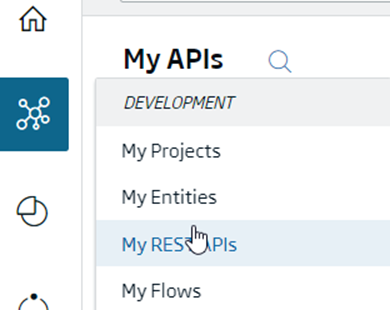
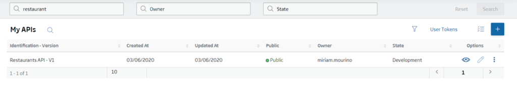
What we are interested in is looking for a REST API with information that can be drawn in PowerBI. These APIs can be found in the menu Development > My REST APIs:
There we can select one of the APIs to which we have access. For example, we can search for the API with information about Restaurants in New York:
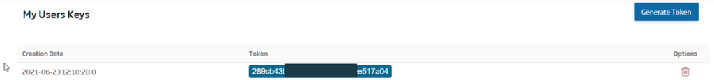
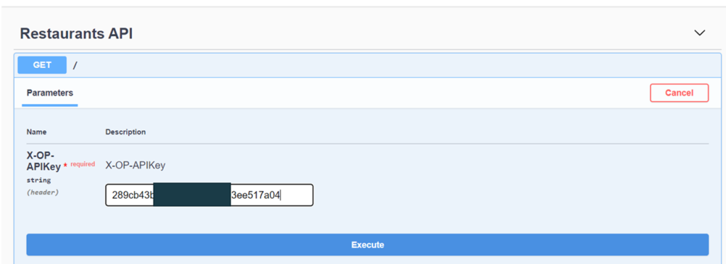
Once we have located the API we are interested in, the first thing we will do is to invoke the API to check what data it returns and to know its structure. To do this, the first thing to do is to navigate to the «User Tokens» option and save the user token, which we will need to authenticate later:
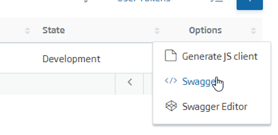
Then navigate to the selected API Swagger option:
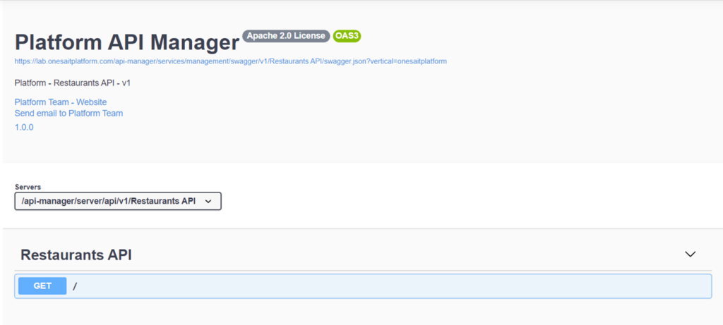
A window will open in which we will visualize the available options of the API. For restaurants, we will see that the API only has a GET method that will return all the registered restaurants:
To get the answer, we will go to the method and select the «Try it out» option, paste the token we have previously copied, and click on the «Execute» button:
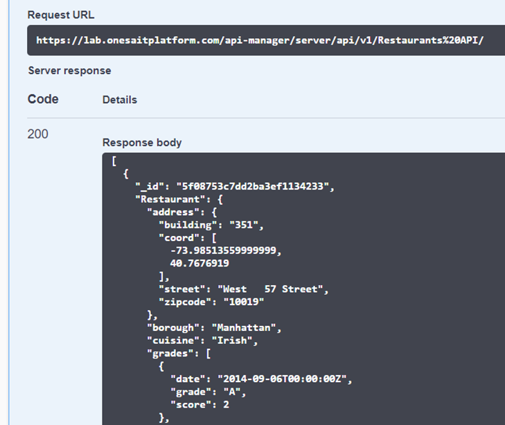
When running it, we will be able to see the structure of each restaurant in the list received:
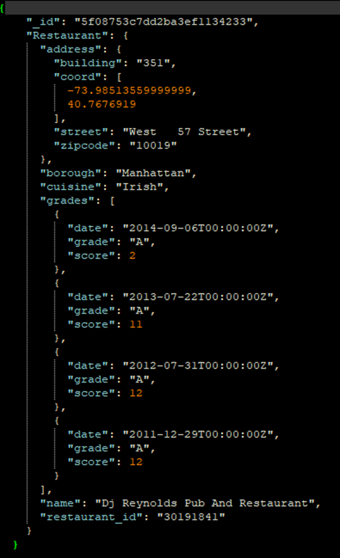
Viewed from an IDE:
Step 3: Import data from the REST API
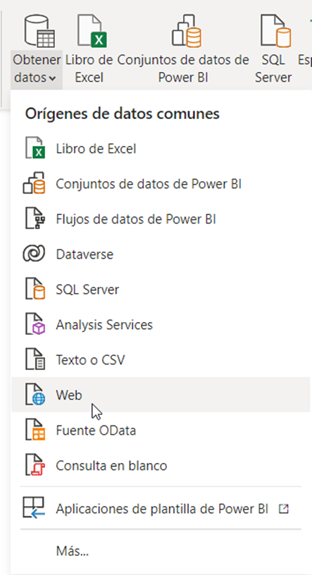
Now that we have the data, let’s open Power BI and go to the Get Data > Web option:
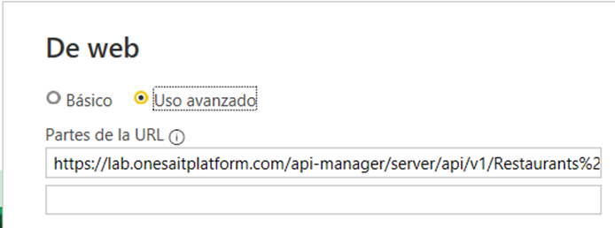
In the URL part we will enter the URL of the REST API of the restaurants (or of the API you have chosen, of course). It is important to check the «Advanced use» option:
As HTTP header we will indicate the following:
accept: application/json
X-OP-APIKey: <mytoken>  // Change «mytoken» for your personal token
In the end we will be left with something like this:
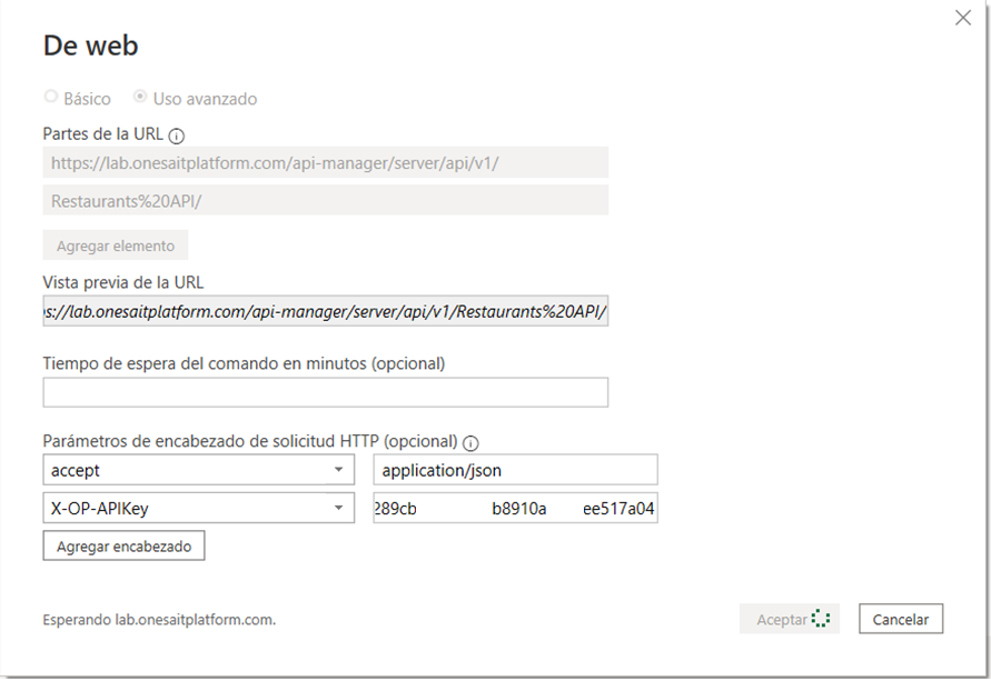
Well, click on «Accept», and then click on «Connect» on the next screen.
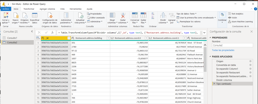
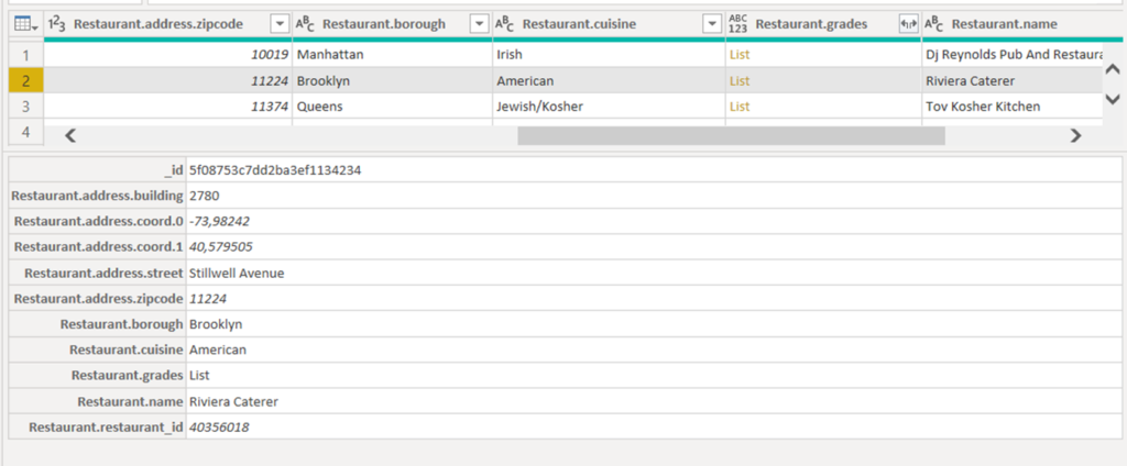
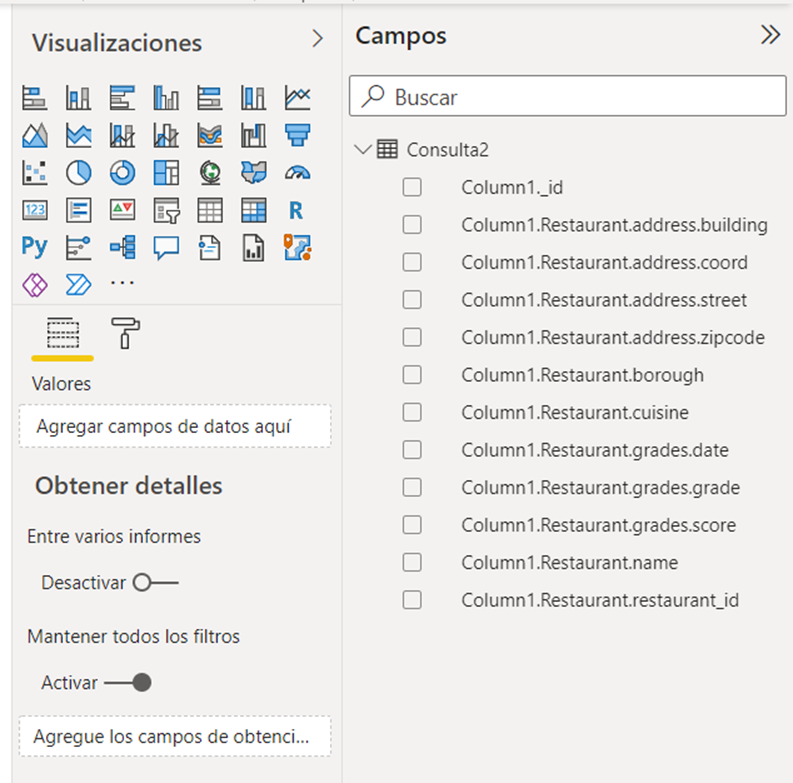
After this, Power BI will open the Query Editor presenting us the JSON imported from the REST API call in a tabular format, as we can see in the image:
If we navigate through the slide, we can see all the fields of each JSON element:
If we click on an element, it will give us the complete information:
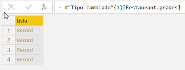
We can see that the attribute «Restaurant.grades» is a list, and if we click on it in the table we access the elements:
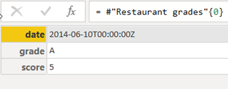
And if we click on the «Record» element, we will see the detail:
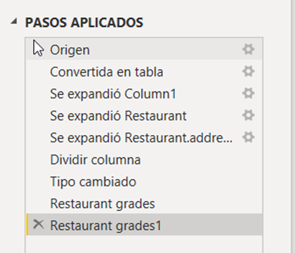
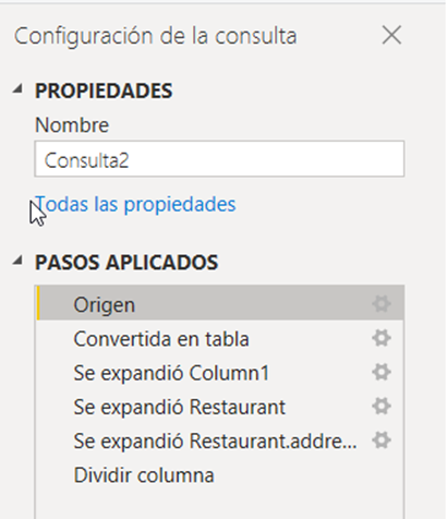
To return to the original table, delete the last steps in the «APPLIED STEPS» window:
Step 4: Convert imported data into a Pivot Table
To create a visualization, it is best to convert the imported data into a table. To do this, go back to «APPLIED STEPS», and click on the first Source element:
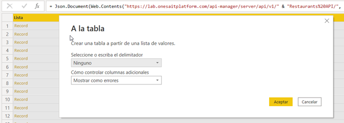
The «Convert to Table» option will then appear, which is the one we will select.
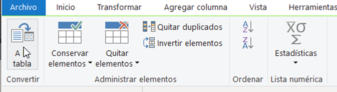
In the modal that will appear, click on «Accept»:
Now, since we want the table to have several columns for the JSON fields, we will click the button on the right:
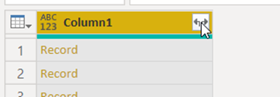
From the possible options that appear, we will select all of them:
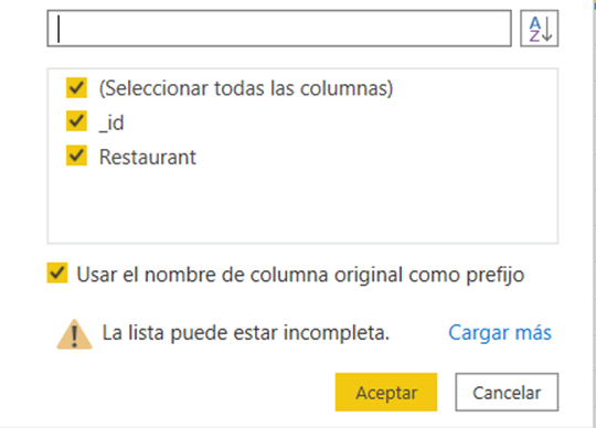
And then we will do the same again on the Restaurant complex attribute:
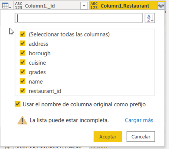
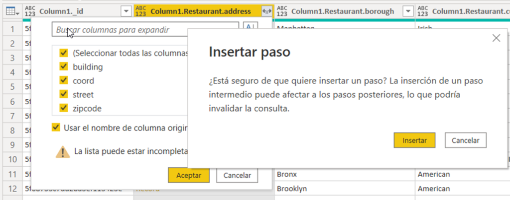
We will do the same for Column1.Restaurant.address and Column1.Restaurants.grades:
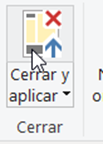
Once this is done, we are seeing all the attributes we are interested in. Therefore, we can click on «Close and Apply»:
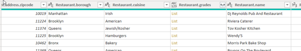
After this, we will have the table loaded in the model, and we can see the columns:
Step 5: Create a visualization in the visualization view
Once we have transformed the data into a table with the Power BI Query Editor, we can create a visualization. We can create different types of visualizations, so let’s look at a few.
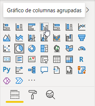
In visualizations, select a visualization in the palette, and you can configure the fields to be displayed by dragging them to the different components.
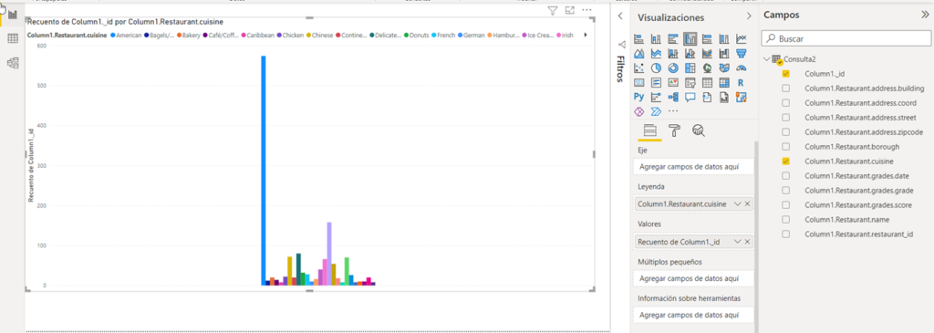
For example, in Legend we can drag Column1.Restaurant.cuisine and in Legend when dragging the _id field it will appear as Count:
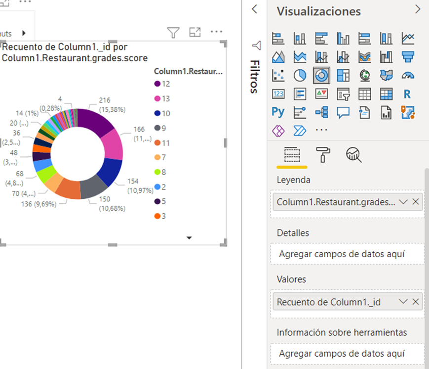
Now we will select another component, such as the pie chart, and in this case we will select the ratings:
In a future post we will see how to create more complex and related visualizations – don’t miss it!