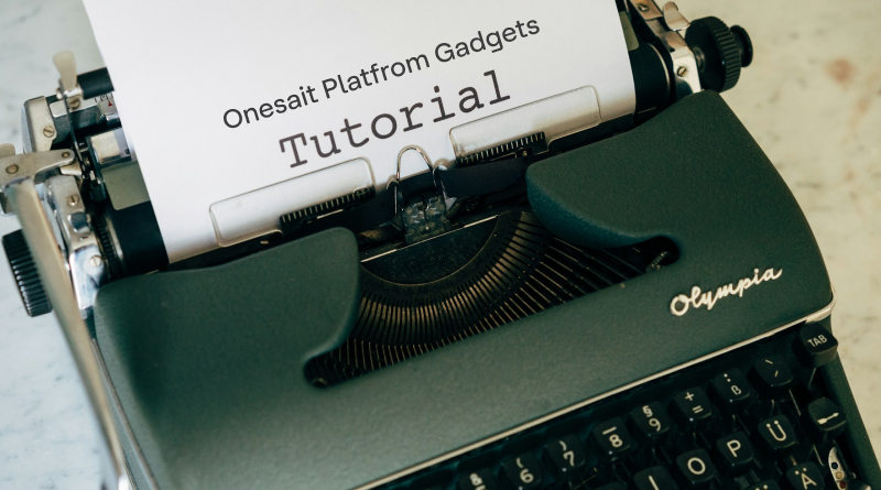
New guidelines for the use of predefined Gadgets
For some time we have been generating new documentation on the use and configuration of predefined Gadgets. So, for this version 7.0.0-Zelda of Onesait Platform we wanted to update the status of these guides.
By means of these guides, and in an interactive way, it will be possible to configure in real time the different options of a Gadget, allowing the user to know the different options available.
Example of a guide
Each Gadget will have its own user guide, which will be a Dashboard in itself, consisting of four pages with relevant information and configuration options of the Gadget. Each page will be accessible through a tab:
- Home.
- Main Settings.
- Data Settings.
- Interaction.
Although it will be possible to access any of the tabs directly, a navigation assistant has been prepared using buttons that will allow the user to navigate in an orderly fashion between the different pages.
Home tab
A first page, called ‘Home’, will contain the basic information about the Gadget, such as its name, description, DataSource usage and interaction information, as well as some examples of how the Gadget works.

Main Settings tab
On this page, the user will be able to play with the different configuration options of the Gadget, visualising in real time the changes he/she makes.

Regarding the properties, these are listed on the right hand side. Each one of them will be shown with the name of its property, and in case it is a sub-property, its nesting will be shown.
For example, the ‘Title’ property would be a main property, which can be edited by selecting it, showing information about what the property is, and the type of value it expects.

In contrast, the ‘Position’ property has two sub-properties: ‘Position X’ and ‘Position Y’, which have to be set separately:

In addition, every property shows in a field its availability, so that if in future versions our properties are added to the Gadgets, it will be possible to know the version in which this property is compatible.
Data Settings tab
This tab shows information about how the Gadget’s information is displayed. Thus, it allows to know the different options that the user will have available for the Gadget in question.

Interaction tab
This last tab shows the interaction between the Gadget and the rest of the Dashboard elements. By interacting with the Gadget, you can see what information is sent when you click on it.

As new predefined Gadgets are released, this Predefined Gadgets section will be updated with their respective tutorials.
Header Image: Markus Winkler at Unsplash
✍🏻 Author(s)