Dashboard for Query profiling
For version 4.2.0-Predator of the Onesait Platform, we have introduced a query metrics system to have more information about the queries that are executed in the system, metrics that are stored in the «QueryMetrics» Entity.
For version 4.3.0-Quest, we have created a new user interface (built as a Dashboard) that allows a complete profiling of the queries that are executed within the Platform.
Let’s see what this profiling is about.
Access and viewing permissions
These query lists can only be viewed by users with an «Administrator» role within the Platform.
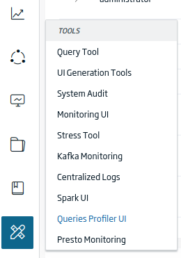
To access, navigate to the «Tools > Queries Profiler UI» menu.
Pages that make up the Dashboard
This Dashboard is made up of two pages, and you can navigate between them using tabs.

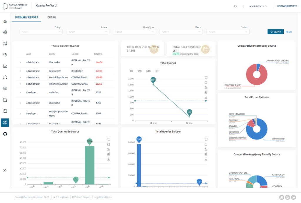
Summary Report
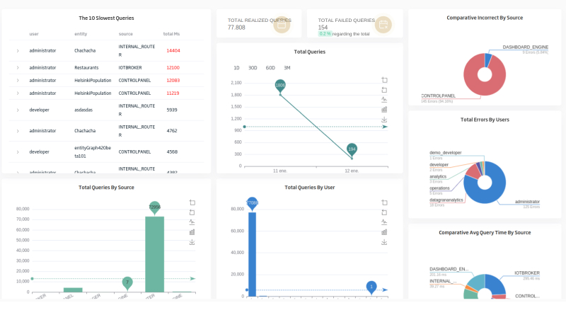
This view shows KPIs, which allow drawing conclusions about which queries are slower, the total number of queries grouped in time, comparisons of the average time spent on the query deppending on the origin, or the total number of queries and of errors from these data or deppending on the users. Besides, data filtering is allowed so that the information can be focused, for example, for certain types of queries, users, entities, etc.
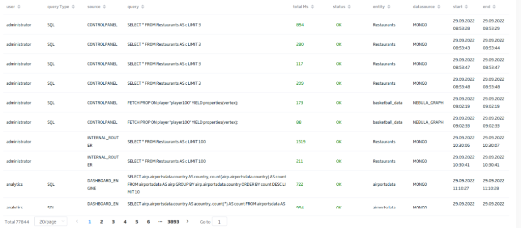
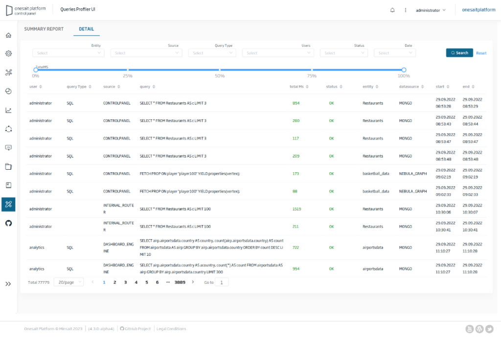
Detail
In this view, you have access to the information of all the queries that are made in the Platform: whether they have been executed correctly or they have given an error; whether the type of query is SQL or MONGO; the component from which it was launched that may have been Control Panel, Dashboard Engine, or other; the milliseconds it took to execute the main entity that was queried; etc.
Composition of the Summary Report page
We will next fragment the different components of the Summary Report view:
Filter form:

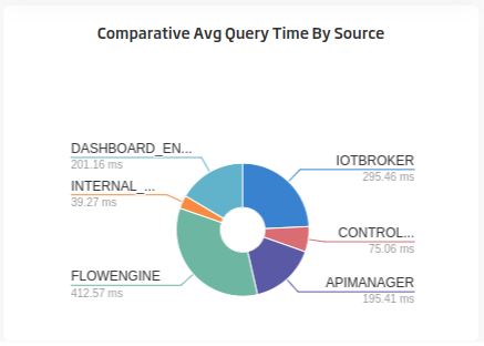
Comparison of the average consumption of queries based on their origin:
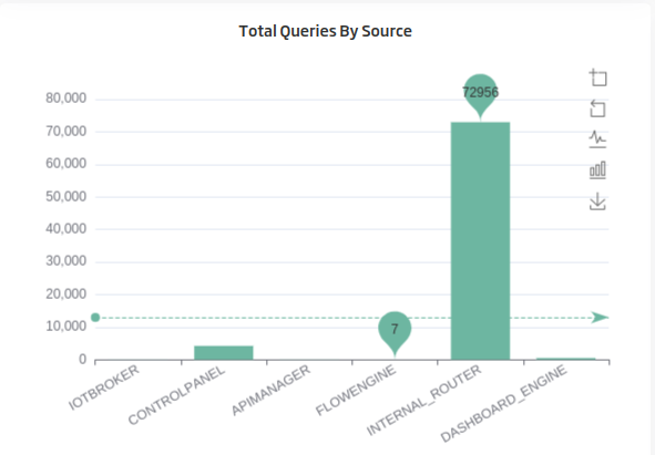
Graph that shows the accumulated number of queries by origin, allows you to zoom in with the mouse, to view it as bars or lines and to download it as an image:
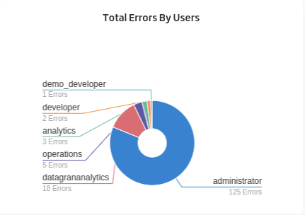
Total errors per user, shows the accumulated number of queries that have given errors per user, allowing those to be compared visually, as in here, for example, where you can see clearly that there is a user with many more erroneous queries than the rest:
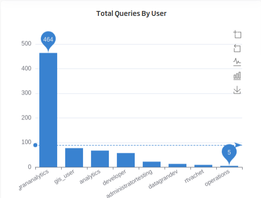
Shows a graph ordered from highest to lowest total number of queries per user. As in the previous bar graph, you can zoom in with the mouse, view it as bars or lines, and download it as an image:
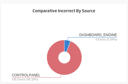
In this case, the comparison is made based on the origin of the query, showing the total number of erroneous queries and the percentage by origin:
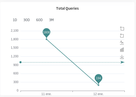
In this graph, you can visualize the total queries by date for the last day, last 30 days, 60 days or three months:
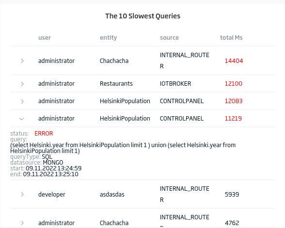
This table shows the information related to the ten queries that have taken the longest to perform, and it can be expanded to show all the details of the query, such as the query itself, the type of query, etc.:
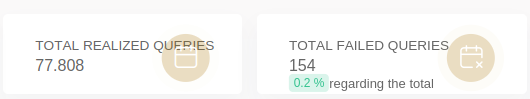
These KPIs show the total number of queries and the total number of wrong queries, with the percentage they represent:
Composition of the Detail page
As in the previous case, next we are going to fragment the different components present in the view.
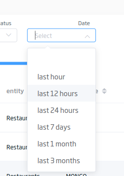
Once more, there is the filter form first:

In that component, you can see that one of the selectors or filters allows selecting date ranges, to simplify the search, so that you can see the records of the last hour, the last 12 hours, etc.:
This component allows you to filter the search in a range of time used in the execution of the queries. If you choose 100%, it would be above the most expensive query.

Table paginated on the server with the information of the queries. It can be sorted by the different fields. It is shown in green or red depending on the status and the time consumed by the query. The information can be filtered by the previous form, which makes it much easier to find the queries to detect possible errors.