How to exploit Twitter data with Dashboards?
Not long ago, we were telling you how we could work with Twitter from our FlowEngine module. As we saw, we could interact with Twitter #hashtags and store the information that was interesting to us (such as content, authors, etc.).
Now then: once we have this information, what could we do with it?
Throughout this post, we are going to see how we can exploit this data stored in Platform Entities to expose and analyze it from our Dashboard module.
As in the previous case, we are going to use CloudLab, our free experimentation environment open to everyone, so we encourage you to use it if you want to do this tutorial.
Data analysis
Taking the Twitter data that we have obtained directly from the Twitter API, and which we have stored in one of our entities (for this example, in a call «TweetsFromFlowEngine»), we are going to exploit them.
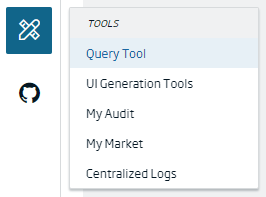
As already shown in the previous post, we are going to use the Query Tool, which is found in the «Tools > Query Tool» menu, and with which we can launch different queries on the data.
To perform these queries, we can use both SQL and the native language (in this case, the MongoDB query language). For the concrete case, we are going to use SQL language, which is the standard query language provided by the Platform.
We are going to launch queries on the data we have, in order to have a base on which to build our analytical Dashboard.
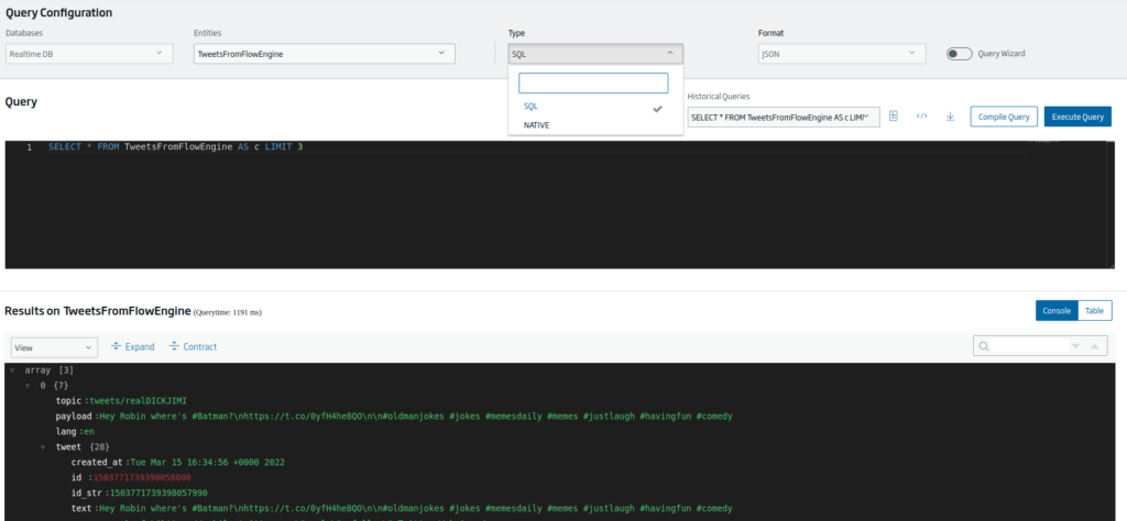
When making these queries, if we do not change the query that is generated by default, we see that the query retrieves only three records of the entity:
SELECT * FROM TweetsFromFlowEngine AS c LIMIT 3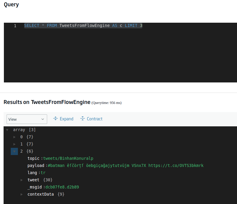
If we want to recover all the data, we only have to eliminate the «LIMIT 3» tagline. Now, this can return a fairly large query (depending on what we have stored), so we are going to start by knowing how many records we have in total.
We can do this using the following query (we highlight the important parts in bold):
SELECT count(*) FROM TweetsFromFlowEngine AS c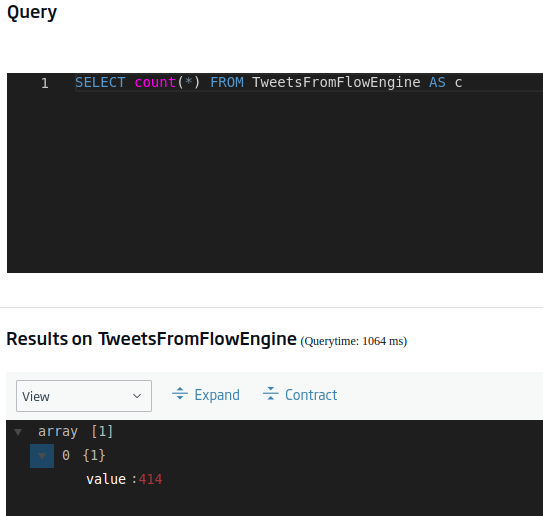
Well, okey, it’s not an disproportionate value, but it’s too big to be counting it manually. Given this, the next step could be to know, for example, the number of records we have for each language present. This query would be:
SELECT lang, count(*) as cc FROM TweetsFromFlowEngine AS c group by lang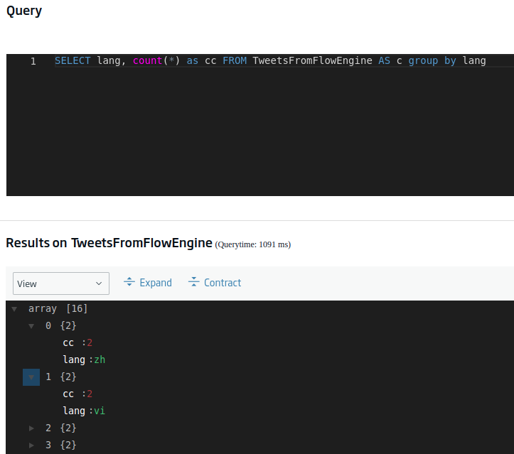
Ok, this is taking shape. A similar but more interesting query would be to order those languages by number of occurrences in descending order, thus obtaining a ranking by language, so to speak. We can achieve this using this query:
SELECT lang, count(*) as cc FROM TweetsFromFlowEngine AS c group by lang order by cc desc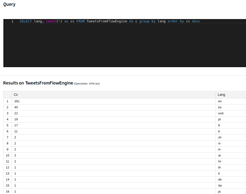
In this case, we have used the table view that makes it easier for us to compress the flat data. How is this option activated? By pressing the following button located on the right side of the screen:
Another field that may be interesting to us is that of the user’s location, an information that we can obtain from the tweets (although with a grain of salt, since it is the value defined by the user). We achieve this with:
SELECT location.place, count(*) as conteoporlugar FROM TweetsFromFlowEngine AS c group by location.place order by conteoporlugar desc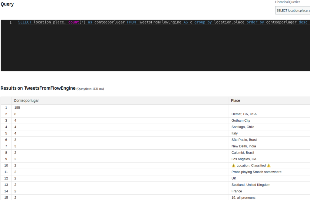
We already told you to be careful with the locations of the users, because whether or not they have them defined, the place they say may not correspond to reality. This could be solved by attending to the «tweet.geo» field, which geolocates where the tweet is written from – but this value is almost always null, since users usually deactivate it for privacy reasons (and if you haven’t already done so, you should).

To avoid null data (which is a bit shabby), we can modify the previous query to:
SELECT location.place, count(*) as conteoporlugar FROM TweetsFromFlowEngine AS c group by location.place where location.place is not null order by conteoporlugar desc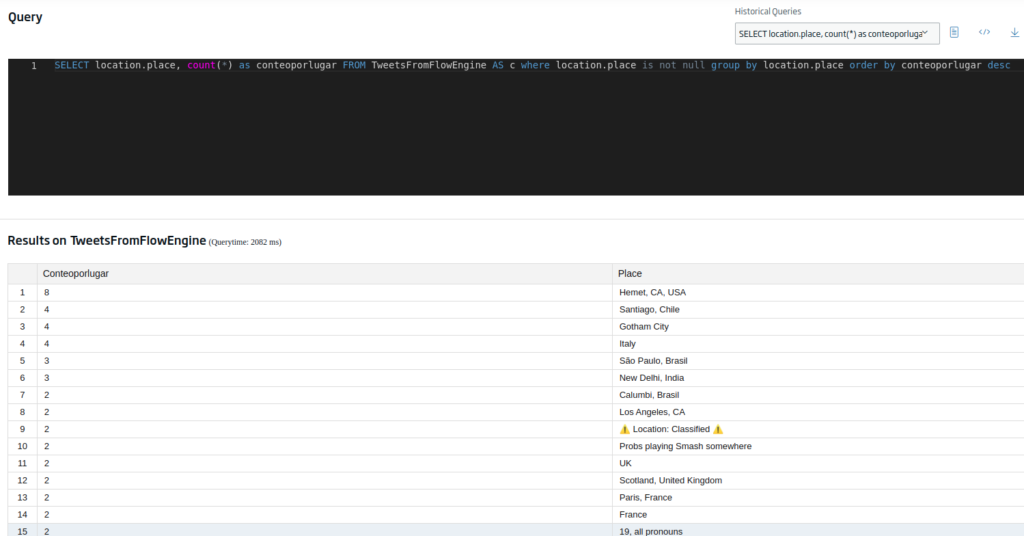
Well, the data is looking good, so we save the query for later, and we have finished the data preprocessing, thus now moving on to the visual representation part.
Dashboard Building
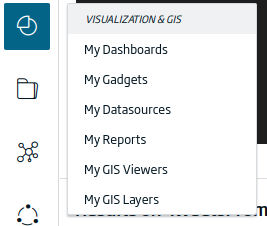
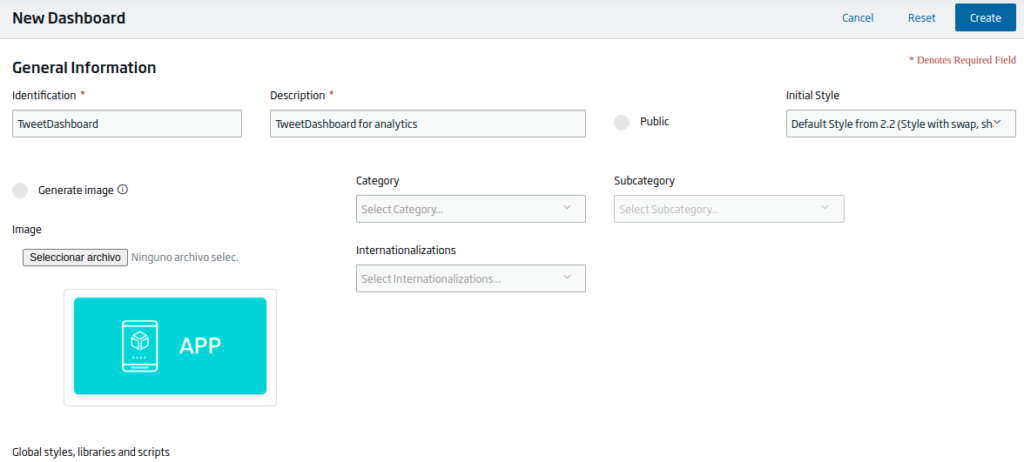
For starters, we are going to generate a new Dashboard. To do this, we will navigate to the «Visualization & GIS > My Dashboards» menu.
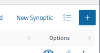
To create a new one, we will click on the «+» button located at the top right of the Dashboards list.
After pressing it, the Dashboard creation form will appear, along with different options to fill in. At this point, we will give our Dashboard a name, include a description and mark the style «Default Style from 2.2». Finally we will click on the «Create» button and our Dashboard will be ready.
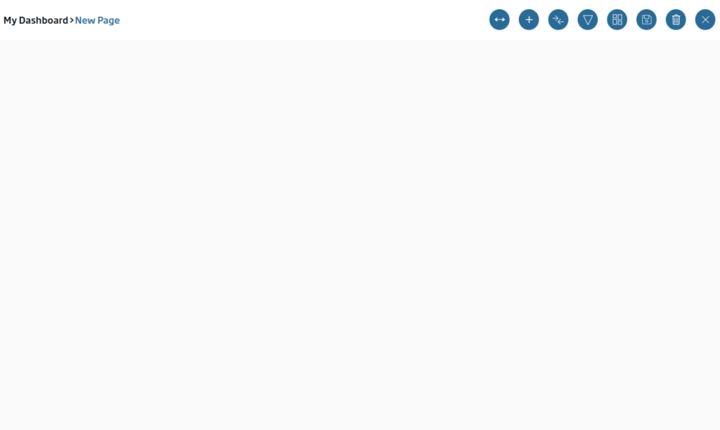
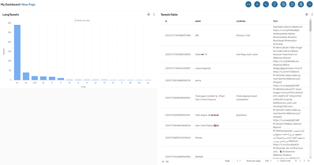
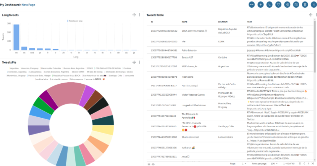
Inside, we can see the canvas on which we can place the Gadgets:
To add our first gadget, we will click on the «+» button, which will make the panel appear, and now we can drag elements from it.
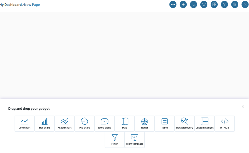
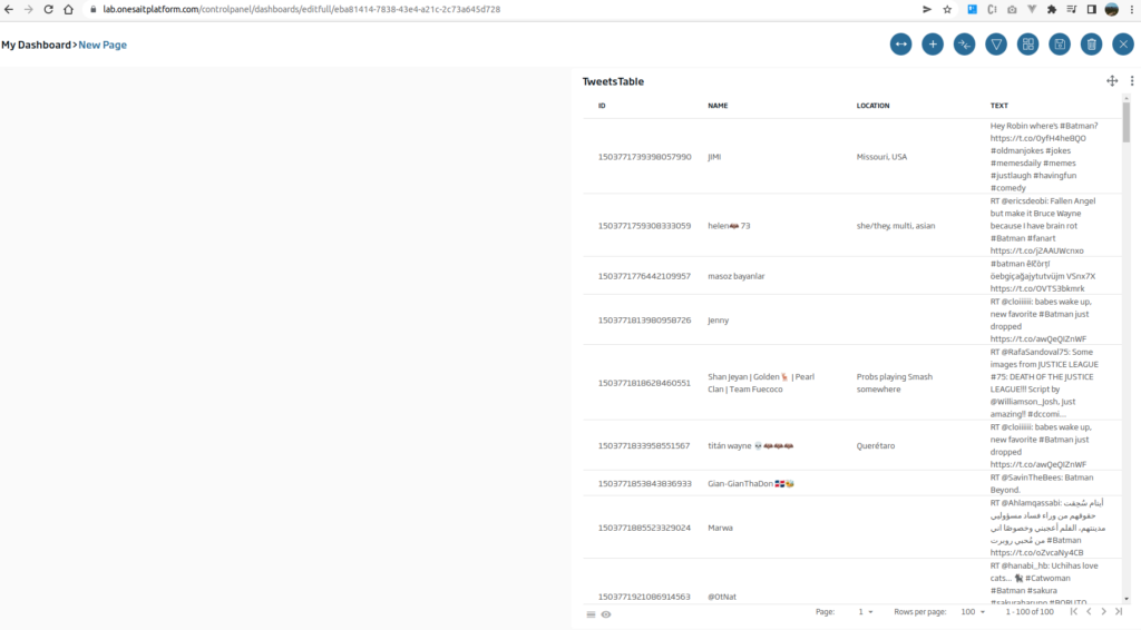
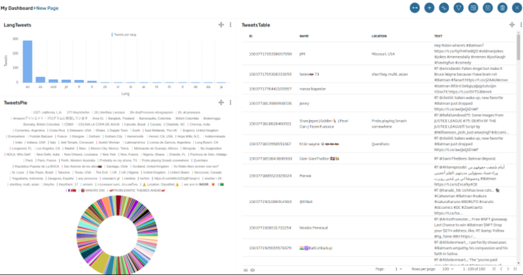
The first gadget that we are going to create will be a table type with the different tweets. To do this, we will drag the «table» icon onto the canvas and drop it. Once this is done, a window will appear indicating what type of Gadget we are going to implement.
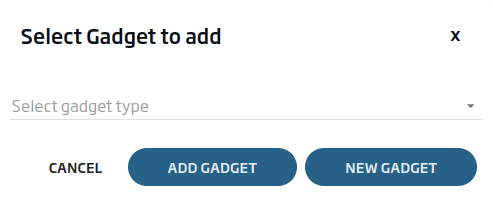
We will click on «New Gadget», since we want to create a new Gadget from scratch. We will give a name and select the «TweetsFromFlowEngine» entity.
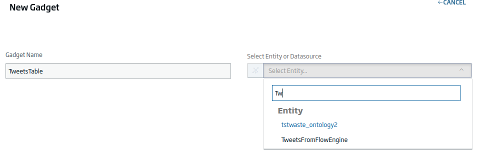
Next, we can enter the data filtering query. In this case, we will leave the one that comes by default.
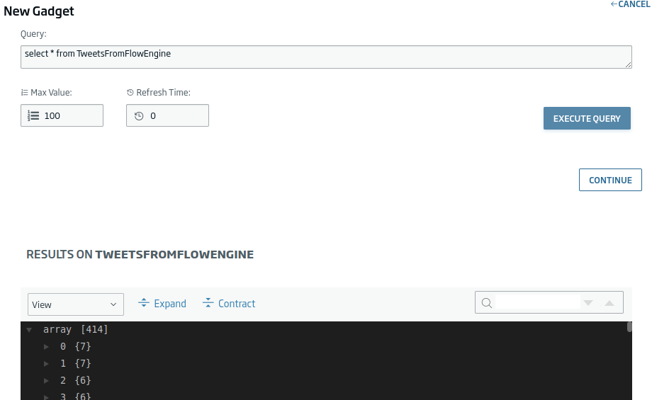
We click on «Continue» and select the following fields:
- Tweet.id_str
- Tweet.user.name
- Tweet.user.location
- Tweet.text
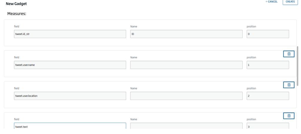
At the bottom of the Gadget, we will see a preview of how it will look:
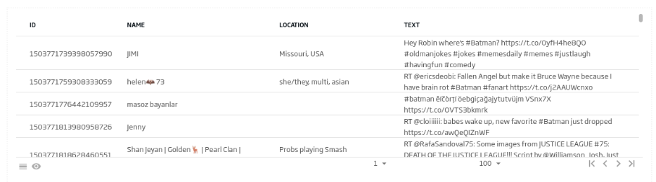
If we like how it looks, we will click on «Create» to generate it.
Next, we are going to generate a bar graph to be able to see how many Tweets there are by language. In this case, we will drag the «Bar Chart» Icon, and we will click on «New Gadget». In this case, we will use the following query:
SELECT lang, count(*) as cc FROM TweetsFromFlowEngine AS c group by lang order by cc desc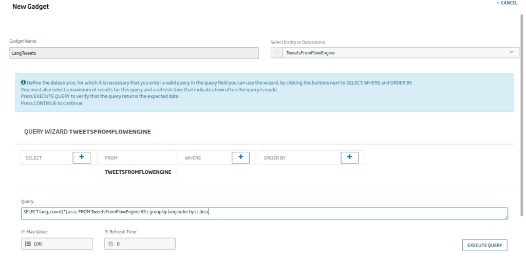
We will click «Continue» and uncheck the «Sort» option since this field would order the display along the X axis, and that is not what we want.
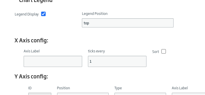
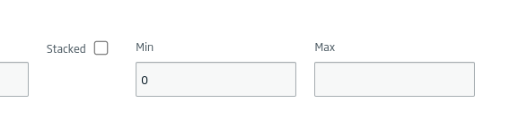
And we will leave the Y axis without a maximum, so that it is automatically recalculated.
Later, we will use the «lang» field with the X axis and «cc» as the Y axis. We can give you some additional style if we consider it necessary.
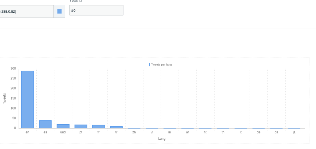
We will click «Create» and we will have our gadget ready.
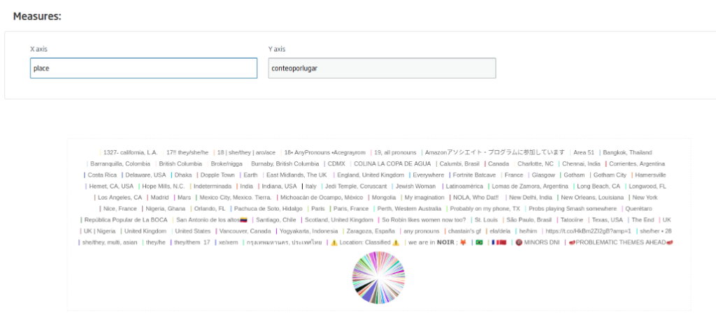
Now we are going to create a pie-type gadget with location information. The query will be as follows:
SELECT location.place, count(*) as conteoporlugar FROM TweetsFromFlowEngine AS c where location.place is not null group by location.place order by conteoporlugar desc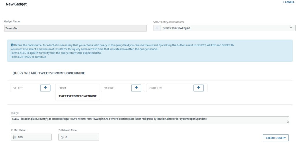
We will use the «place» and «conteporlugar» (count by place) fields as axes.
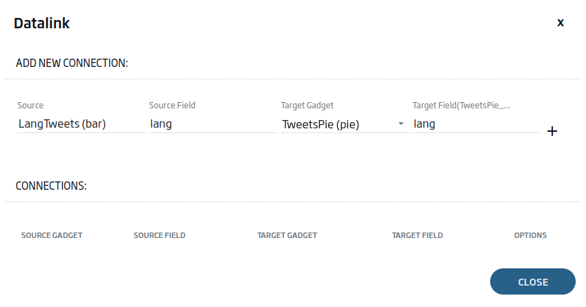
Next, we are going to connect the gadgets to each other, so that we can filter by the «lang» field from the bar gadget. To do this, we will use the «Datalink» button.
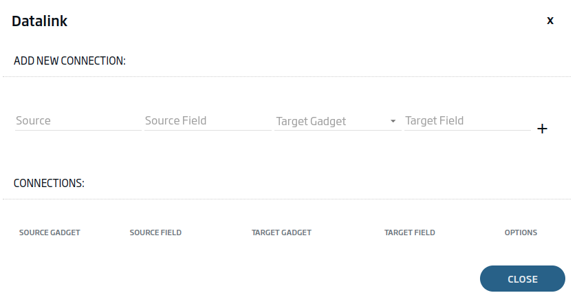
We will select the table type Gadget and the «lang» field as the source. As a destination, both Gadgets and the «lang» field. In this case, we will have to explicitly write the «lang» field in the destination, as it is a field that the query does not provide.
With the two connections added, we will have something like this:
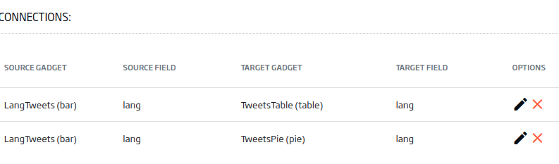
Once this is done, we will close the Datalink and we will be able to verify that, by pressing the bars of the first gadget, we are able to filter the other two:
Friendly reminder: This is a good time to save the Dashboard with the button and avoid losing the work done.
Finally, using different Dashboard options, we can style it to have a more attractive presentation:
Header image by Stephen Dawson at Unsplash.