Usability improvements in the Dashboard Engine
For this release 5.1.0 of Onesait Platform, we wanted to dedicate some time to the Dashboards, since it is one of the most used tools to represent the data with which we work.
Specifically, we have focused on improving the usability of the Dashboard Engine, thinking that it can be a business user who creates these control panels on pre-built Gadgets, which will allow her to generate her graphic representations quickly and easily.
Let’s see what improvements we have incorporated.
Pagination and display of Dashboards in card mode
When you work with just a few Dashboards, you have no problem finding the one that you’re looking for at a given time, but what happens when the list is huge? And when we say huge, we are talking about hundreds of them.
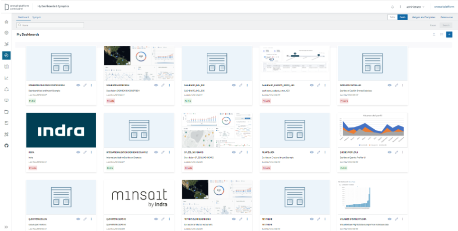
To help manage a high volume of Dashboards, we’ve added two handy enhancements: pagination and card mode viewing.
Pagination
To speed up the loading of content, Dashboards will use server paging. As you go down the screen scroll, you can load more Dashboards as you need, which will make everything work more smoothly.
Card mode viewing
By default, the Dashboard list will load in this mode, which will allow you to view the list of Dashboards and Synoptics in card mode. If you have included an image in the configuration of the control panel, you can view it, which will facilitate its visual search in the list.
Gadget side menu redesign
If you remember, in the previous release of the Platform we launched a new user interface for custom Gadgets, adding a new side window where you can modify the Gadget parameters interactively.
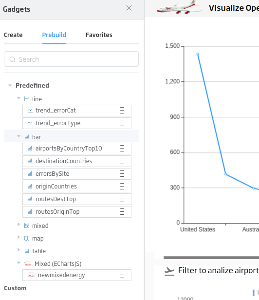
This improvement has been very well received, so, continuing with the interface changes, we have given the Gadgets side menu a thought. If you remember, up until now it consisted of a list of the different Gadgets that, while practical have them all well grouped, perhaps they were not intuitive when it came to finding a specific Gadget that we may be looking for.
For this reason, we have once again included the icons of the predefined Gadgets, and we have also added tabs to the different types of Gadgets, which will allow easy navigation between the different options.
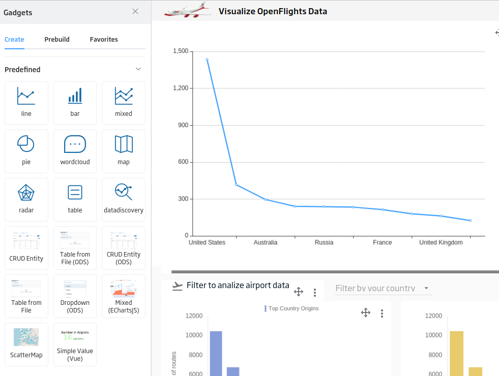
The Gadgets that you have previously created (either custom or pre-built) will appear in the corresponding section of the menu:
Gadgets creation in inline mode
Up until now, when you created a Gadget in a Dashboard, you had to define its properties to store it in the Gadgets list. This, although useful, took a while and was not always necessary, since sometimes you only wanted to create a Gadget to see how it would look or to carry out some test.
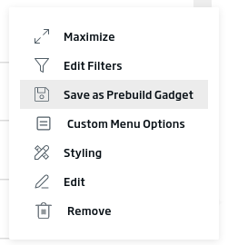
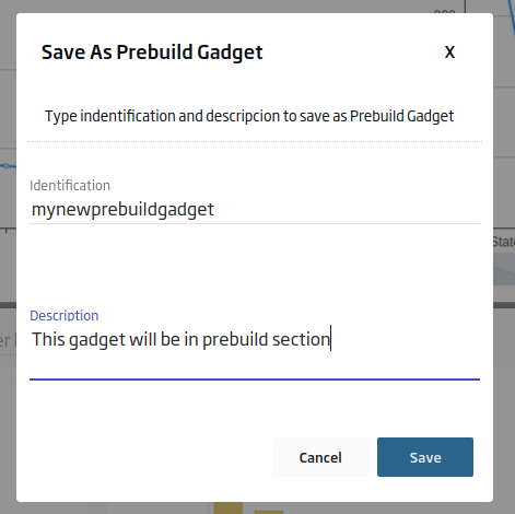
From this version, all Gadgets that you create will be of the inline type, which reduces the steps necessary to create them – and if you like how the Gadget looks, you can always save it as before, using a contextual menu option.
Style update
We have updated the styles of the windows and borders of the Dashboards, to homogenize them with the rest of the elements of the Platform.
Control of the gadget library by including it in the Dashboard
If you usually work with third-party libraries, this new feature will surely be of your interest.
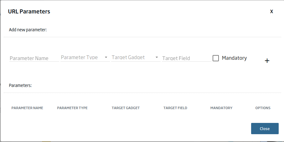
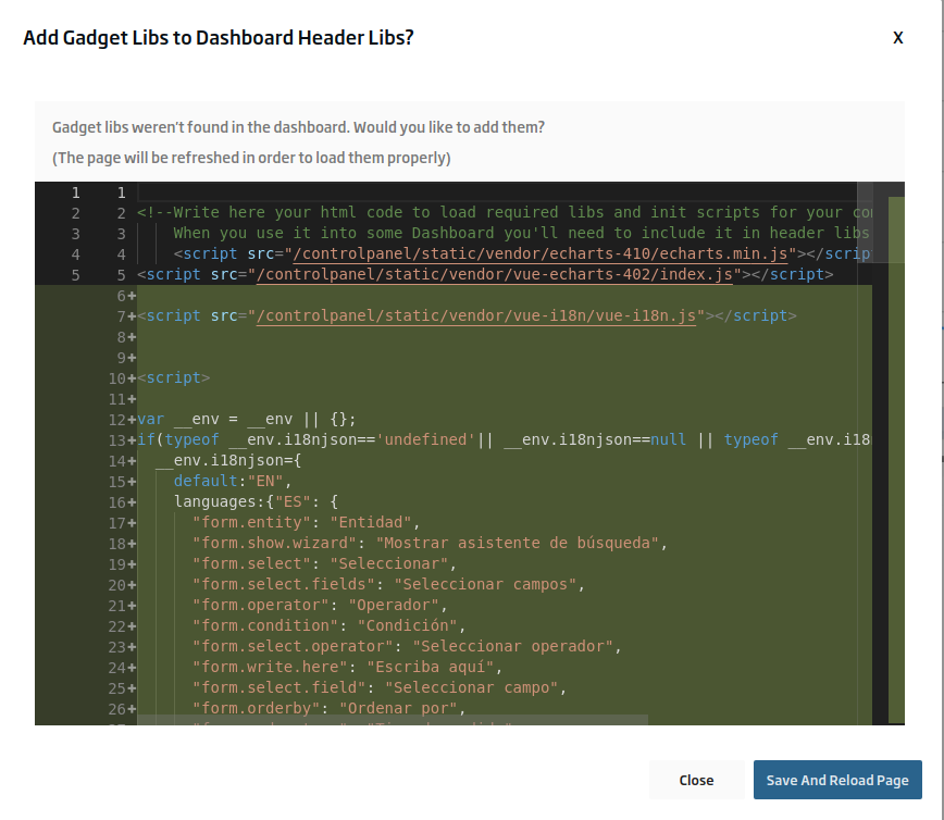
We have included a controller that will allow you, completely optionally, to automatically add the associated libraries of the Gadget Templates. For example, if you are setting up a Cesium map by importing its library in the Gadget Template, then with this option it will automatically be included in the Dashboard, and will work by default.
Improvements in editing Gadgets in the Dashboard
There are two types of people: those that edit the Gadgets from the Gadgets manager, and those that edit them from the Dashboard itself.
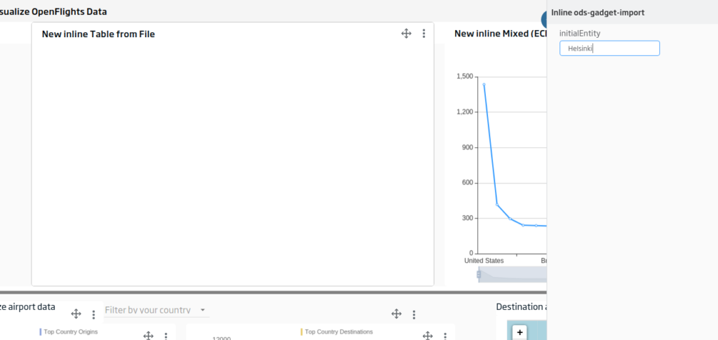
In this second case, we have improved the focus of the Gadget that you may creating and/or editing, marking it visually, to facilitate its identification.
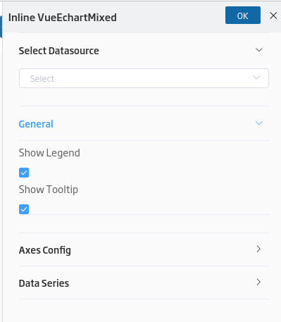
Also, now the parameter sections can be collapsed to have a clearer view of them:
As we can see, we have dedicated time and care to improve our dashboard engine, making it more accessible and functional.
If you are interested in learning more about this new functionality, leave us a comment or contact us via support channels, and we will be happy to show you how it works.
Header image: Sheldon at Unsplash.

