
IoT for around the house: Connecting a sensor with the Onesait Platform (part III)
And so we arrive to the third and -for now- last entry in our adventure about connecting a sensor at home and sending the measurements to the Onesait Platform.
In the first entry, we saw how to choose the working environment and set up both the ontology and the API service to ingest the data. In the second part, I told you how to hook the cables between the boards, how to configure the Arduino IDE to work, how to write the code that collects and sends the measurements to the Platform, and how to see that it was indeed received correctly.
Well, today we are going to talk about how to represent the data in a moderately attractive way, because viewing a string of data may be good, but is perhaps not optimal when I want to see what’s the temperature right now or was during the last hour. This entry is just a sample of what you can do, meaning that, if you master SQL, HTML/CSS and/or JavaScript, you can set up something very interesting.
Here we go. The objective is to create a Dashboard in the Platform that shows us the information from the sensors. Just for variety, we can show the information of the two sensors, in real time, in boxes (option A) or in the home blueprints (option B), and show the accumulated information of the last hour in a graph. To put it another way, we can do this:
You can navigate between the tabs to see the different representations of the data. To see the «Home Map» option properly, I recommend you to see the Dashboard in large size.
To get this, first we are going to generate some Datasources in which the existing data in the ontologies will be processed, and the output for what we are going to need will be formatted. Then, we are going to generate the Gadgets where we are going to represent the data from the created Datasources. When we have them, we will only have to add those to the Dashboard and – that’s it!
Creation of the Datasources
Let’s start with the «harshest» part of this topic, which involves SQL queries. The first thing is to ask: What are we going to need?
We want to represent in a Gadget the real-time values (in other words, the last records) of temperature and humidity for each room in the house. Therefore, we will have to obtain the last temperature value and the last humidity value (obviously ordered by date) for each type of sensor. No sooner said than done, let’s get to it.
We navigate to the menu Visualization and GIS > My Datasources, and once there, we create a new Datasource, filling in the fields as indicated below:
- Identification: the first Datasource that I am going to create corresponds to the sensor in the dining room, so I will give it a name to relate it to: «arduinoDHT22_diningRoom_last» (remember that, if you are following the steps of this tutorial, you cannot duplicate the names, so I recommend you add your initials or something similar to the name you give the Datasource).
- Select ontology: here we will select the ontology in which we are storing the data, which in my case is «arduinoDHT22».
- Maximum records: we leave this one as «1», because we are only going to recover one object.
- Refresh time: this point is important. The value specified here will be the time in seconds that the Datasource will use to update its data. That is to say, if we say 60 seconds here, as in my case, it will update its data by reading the ontology every 60 seconds. Thanks to this option, every minute we automatically obtain the last value.
- Description: in this short field, you can enter a description of what your datasource does.
- Datasource query: this is where we make magic using SQL to obtain what we want from the ontology. I think it’s better if I explain this part bit by bit, sowe are going to see it carefully below.
Generating the Datasource Query
If you’re fluent in that SQL with Quasar thingy (here they talk about that, in Spanish), you’ll surely do a much better job than I’m going to do. If not, come with me on this dangerous path to the promised query.
Say that we start from this query:
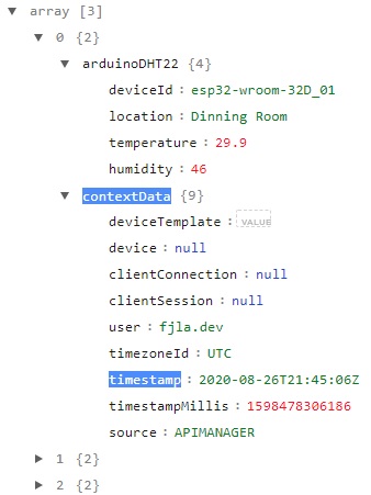
SELECT * FROM arduinoDHT22 AS tableThis will return everything in the ontology.
[{"arduinoDHT22":{"deviceId":"esp32-wroom-32D_01","location":"Dinning Room","temperature":29.9,"humidity":46},"contextData":{"deviceTemplate":"","device":null,"clientConnection":null,"clientSession":null,"user":"fjla.dev","timezoneId":"UTC","timestamp":"2020-08-26T21:45:06Z","timestampMillis":1598478306186,"source":"APIMANAGER"}},{"arduinoDHT22":{"deviceId":"esp32-wroom-32D_01","location":"Dinning Room","temperature":29.9,"humidity":45.5},"contextData":{"deviceTemplate":"","device":null,"clientConnection":null,"clientSession":null,"user":"fjla.dev","timezoneId":"UTC","timestamp":"2020-08-26T21:46:13Z","timestampMillis":1598478373455,"source":"APIMANAGER"}},{"arduinoDHT22":{"deviceId":"esp32-wroom-32D_01","location":"Dinning Room","temperature":29.9,"humidity":45.8},"contextData":{"deviceTemplate":"","device":null,"clientConnection":null,"clientSession":null,"user":"fjla.dev","timezoneId":"UTC","timestamp":"2020-08-26T21:47:15Z","timestampMillis":1598478435439,"source":"APIMANAGER"}}... ]But we are not interested in all the existing fields – we only want the sensor identification, its location, temperature, humidity and date. Considering this, we will generate a query that returns only that information, ordered:
SELECT
table.arduinoDHT22.deviceId,
table.arduinoDHT22.location,
table.arduinoDHT22.temperature
FROM arduinoDHT22 AS table
This query gives us something closer to what we are looking for:
[{"deviceId":"esp32-wroom-32D_01","location":"Dinning Room","temperature":29.9},{"deviceId":"esp32-wroom-32D_01","location":"Dinning Room","temperature":29.9},{"deviceId":"esp32-wroom-32D_01","location":"Dinning Room","temperature":29.9}... ]Next we will filter the sensor’s location, so that we can differentiate between the living room and the office. We will do this by adding a «WHERE» condition differentiating between ‘Dining Room’ and ‘Office’. If you have used different names, this is where you will have to filter them:
SELECT
table.arduinoDHT22.deviceId,
table.arduinoDHT22.location,
table.arduinoDHT22.temperature
FROM arduinoDHT22 AS table
WHERE table.arduinoDHT22.location = 'Dinning Room'
In this case the output will be the same I’ve shown you before, but by changing it to ‘Office’, it outputs something like this:
[{"deviceId":"esp32-wroom-32D_02","location":"Office","temperature":28.2},{"deviceId":"esp32-wroom-32D_02","location":"Office","temperature":28.1},{"deviceId":"esp32-wroom-32D_02","location":"Office","temperature":28.1}... ]Nevertheless, the data we are recovering go from beginning to end. In other words, the first data is the oldest one, and the last one is the most recent one. We are interested only in the last value, so we are going to order the query in a descending order (most recent first), using the «timestamp» field.
Yeah, I know: we don’t have a timestamp field because I am too lazy and I don’t send that from the sensor when I’m measuring. I’m sure someone has thought about it, but has been less lazy than me and added it. Great. In my case I will use the timestamp of the data intake in the ontology. Isn’t that perfect?
This timestamp is not in the object «arduinoDHT22», but in another object at the same level called «contextData».
We want to filter the query from that field so that the most recent information is displayed first.TO do this, we will update the query using the «ORDER BY» in «DESC» mode. We will also include the timestamp as one of the values to be recovered.
SELECT
table.arduinoDHT22.deviceId,
table.arduinoDHT22.location,
table.arduinoDHT22.temperature,
table.arduinoDHT22.humidity,
table.contextData.timestamp
FROM arduinoDHT22 AS table
WHERE table.arduinoDHT22.location = 'Dinning Room'
ORDER BY table.contextData.timestamp DESC
The data is now correctly sorted. Give a look at the measurement times so that you can see that this is not a swindle:
{"deviceId":"esp32-wroom-32D_01","location":"Dinning Room","temperature":25.5,"humidity":62.5,"timestamp":"2020-09-23T14:52:12Z"},{"deviceId":"esp32-wroom-32D_01","location":"Dinning Room","temperature":25.5,"humidity":62.5,"timestamp":"2020-09-23T14:51:09Z"},{"deviceId":"esp32-wroom-32D_01","location":"Dinning Room","temperature":25.4,"humidity":62.3,"timestamp":"2020-09-23T14:50:07Z"}The first data is from 14:52 (notice that is in UTC+0, not +2), the second is from 14:51, the third is from 14:50… Meaning that this is just as we wanted. However, we have way too many data when we are only interested in the last one. Well, this is easy to solve: Just add a «LIMIT» and that’s it:
SELECT
table.arduinoDHT22.deviceId,
table.arduinoDHT22.location,
table.arduinoDHT22.temperature,
table.arduinoDHT22.humidity,
table.contextData.timestamp
FROM arduinoDHT22 AS table
WHERE table.arduinoDHT22.location = 'Dinning Room'
ORDER BY table.contextData.timestamp DESC
LIMIT 1
And with this, we now have it last record obtained from the sensor:
[{"deviceId":"esp32-wroom-32D_01","location":"Dinning Room","temperature":25.4,"humidity":62.3,"timestamp":"2020-09-23T14:53:14Z"}]We now have to repeat this with a similar Datasource, but for the office instead of the dining room. You only have to change ‘Dining Room’ for ‘Office’ (again, in my case), so I leave that to you.
The other type of Datasource we are going to create corresponds to the one we are going to use to generate the temperature evolution graph for the last hour. The idea here is to recover the last sixty temperature records corresponding to the dining room. The query is very similar to what we have previously generated:
SELECT
table.arduinoDHT22.temperature,
table.contextData.timestamp
FROM arduinoDHT22 AS table
WHERE table.arduinoDHT22.location = 'Dinning Room'
ORDER BY table.contextData.timestamp DESC
LIMIT 60
The result is a list of the last 60 temperature records in the dining room.
[{"temperature":25.5,"timestamp":"2020-09-23T15:02:34Z"},{"temperature":25.4,"timestamp":"2020-09-23T15:01:32Z"},{"temperature":25.4,"timestamp":"2020-09-23T15:00:30Z"},{"temperature":25.4,"timestamp":"2020-09-23T14:59:27Z"},{"temperature":25.4,"timestamp":"2020-09-23T14:58:25Z"},{"temperature":25.4,"timestamp":"2020-09-23T14:57:23Z"}... ]It seems simple, doesn’t it? Well, let me tell you that we have finished the dangerous path, and now we move on to the paint and color part.
Generating the Dashboard
Some people prefer to first create the elements they are going to use, and later create the dashboard to embed them. That’s not me at all. Therefore, from the Visualization and GIS > My Dashboards menu we will create a new «Dashboard» for our sensor project.
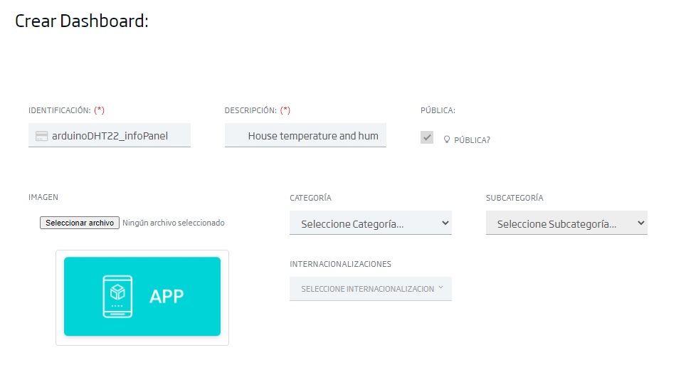
When creating it, we will enter the following information:
- Identification: the name the Dashboard will have. For this tutorial, I’ve given it the name «arduinoDHT22_infoPanel», but, like in previous cases if you are doing the tutorial too, modify the name with your initials or something. You already know that you cannot duplicate names.
- Description: here you can enter some text describing your Dashboard.
- Public: if you want anyone to be able to access it without being registered. For example, my dashboard is public, so that I can embed it in this blog so that you can check it, without logging.
- Category and Subcategory: I’ve left those empty, but you can fill them in if you want.
Once we have created the Dashboard, we will decorate it to our liking (header, background colour, etc.) and leave it ready to be filled with gadgets.
Preparing the Gadgets
Let’s now generate our first Gadget, with cute colours and icons, to shows us the temperature and humidity in one of the rooms.
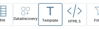
This type of Gadget we are going to create doesn’t have a predefined template. Instead, we will have to create it from scratch (that’s why we don’t do it from the Gadget creator). To do this, from the Dashboard itself, click on the ( + ) button and, in the different options that appear, choose the «Template» option.
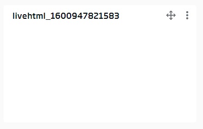
When we’re asked whether we want to use any template or not, we say no. This will generate an empty gadget that looks like this:
By selecting the three vertical dots at the top right, we will access the Gadget menu. From the different options available, we select «Edit», which will open the Gadget’s code editor.
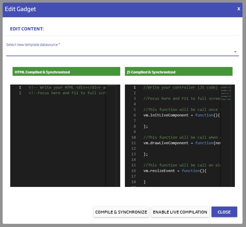
If you have worked before with Gadgets like this, there is no mystery to that: To the left, we add the HTML and CSS code (we are going to make a, let’s call it a mini web page), and to the right we include the JavaScript code necessary to make the logic and stuff.
For my example card, I have created a list of sorts in which the temperature is shown with a temperature icon, then the humidity with a humidity icon. Explained on a code level, this would look more or less like this:
<!-- Write your HTML <div></div> and CSS <style></style> here -->
<!--Focus here and F11 to full screen editor-->
<style>
    #container {
        display: flex;
        flex-direction: column;
        justify-content: space-around;
        align-items: center;
        width: 100%;
        height: 100%;
    }
    .row {
        display: flex;
        justify-content: space-between;
        align-items: center;
        width: 100%;
        height: 100px;
    }
    .icon-temperature {
        background-image: url("data:image/svg+xml,%3Csvg xmlns='http://www.w3.org/2000/svg' width='60' height='60' viewBox='0 0 60 60'%3E%3Cg id='Grupo_7' data-name='Grupo 7' transform='translate(-91 -3034)'%3E%3Ccircle id='Elipse_2' data-name='Elipse 2' cx='30' cy='30' r='30' transform='translate(91 3034)' fill='%23eebe22'/%3E%3Cg id='termometro_1_' data-name='termometro (1)' transform='translate(110.105 3042.09)'%3E%3Cg id='Grupo_2' data-name='Grupo 2' transform='translate(0)'%3E%3Cg id='Grupo_1' data-name='Grupo 1'%3E%3Cpath id='Trazado_1' data-name='Trazado 1' d='M146.359,24.836V7.344a7.344,7.344,0,1,0-14.687,0V24.836a11.015,11.015,0,1,0,14.687,0ZM139.015,40.39a7.344,7.344,0,0,1-4.895-12.818l1.223-1.095V7.344a3.672,3.672,0,1,1,7.344,0V26.477l1.223,1.095a7.344,7.344,0,0,1-4.895,12.818Z' transform='translate(-128 0)' fill='%23fff'/%3E%3C/g%3E%3C/g%3E%3Cg id='Grupo_4' data-name='Grupo 4' transform='translate(9.18 14.687)'%3E%3Cg id='Grupo_3' data-name='Grupo 3'%3E%3Crect id='Rectángulo_2' data-name='Rectángulo 2' width='3.672' height='22.031' fill='%23fff'/%3E%3C/g%3E%3C/g%3E%3Cg id='Grupo_6' data-name='Grupo 6' transform='translate(6.091 27.605)'%3E%3Cg id='Grupo_5' data-name='Grupo 5' transform='translate(0 0)'%3E%3Cellipse id='Elipse_1' data-name='Elipse 1' cx='5.5' cy='5' rx='5.5' ry='5' transform='translate(-0.196 0.306)' fill='%23fff'/%3E%3C/g%3E%3C/g%3E%3C/g%3E%3C/g%3E%3C/svg%3E");
        width: 60px;
        height: 60px;
    }
    .icon-humidity {
        background-image: url("data:image/svg+xml,%3Csvg xmlns='http://www.w3.org/2000/svg' width='60' height='60' viewBox='0 0 60 60'%3E%3Cg id='Grupo_12' data-name='Grupo 12' transform='translate(-158 -3034)'%3E%3Ccircle id='Elipse_3' data-name='Elipse 3' cx='30' cy='30' r='30' transform='translate(158 3034)' fill='%2327bef6'/%3E%3Cg id='soltar_1_' data-name='soltar (1)' transform='translate(130.768 3042.084)'%3E%3Cg id='Grupo_9' data-name='Grupo 9' transform='translate(41.232 0)'%3E%3Cg id='Grupo_8' data-name='Grupo 8' transform='translate(0 0)'%3E%3Cpath id='Trazado_2' data-name='Trazado 2' d='M61.1,4.842C60.083,3.351,59.188,1.978,58.353.726a1.816,1.816,0,0,0-.477-.477,1.554,1.554,0,0,0-2.148.477c-.776,1.253-1.67,2.565-2.744,4.116-4.713,6.92-11.752,17.36-11.752,23.325a15.738,15.738,0,0,0,4.653,11.156,15.938,15.938,0,0,0,11.156,4.593A15.887,15.887,0,0,0,72.849,28.108C72.849,22.142,65.81,11.762,61.1,4.842Zm4.951,32.274a12.617,12.617,0,0,1-9.008,3.7,12.868,12.868,0,0,1-9.008-3.7,12.617,12.617,0,0,1-3.7-9.008c0-5.011,6.741-14.974,11.215-21.6.537-.776,1.014-1.551,1.491-2.207.477.656.954,1.432,1.491,2.207,4.474,6.681,11.215,16.584,11.215,21.6A12.868,12.868,0,0,1,66.049,37.115Z' transform='translate(-41.232 0)' fill='%23fff'/%3E%3C/g%3E%3C/g%3E%3Cg id='Grupo_11' data-name='Grupo 11' transform='translate(60.012 27.03)'%3E%3Cg id='Grupo_10' data-name='Grupo 10'%3E%3Cpath id='Trazado_3' data-name='Trazado 3' d='M173.428,181.243a1.529,1.529,0,0,0-1.611,1.432,7.679,7.679,0,0,1-1.133,3.639,7.25,7.25,0,0,1-2.744,2.625,1.576,1.576,0,0,0,1.551,2.744,10.337,10.337,0,0,0,3.818-3.7,10.152,10.152,0,0,0,1.551-5.13A1.529,1.529,0,0,0,173.428,181.243Z' transform='translate(-167.152 -181.24)' fill='%23fff'/%3E%3C/g%3E%3C/g%3E%3C/g%3E%3C/g%3E%3C/svg%3E%0A");
        width: 60px;
        height: 60px;
    }
    .measure {
        font-weight: bold;
        margin-left: -40px;
    }
    #value {
        font-size: 300%;
        margin-left: -20px;
    }
    .unit {
        margin-left: -60px;
        margin-top: -20px;
    }
</style>

<div id="container" class="dinningRoom">
    <div class="row">
        <div class="icon-temperature"></div>
        <div class="measure">Temperature</div>
        <div id="value" class="temperature">-</div>
        <div class="unit">ºC</div>
    </div>
    <div class="row">
        <div class="icon-humidity"></div>
        <div class="measure">Humidity</div>
        <div id="value" class="humidity">-</div>
        <div class="unit">%</div>
    </div>
</div>
Anyone knowing a bit of HTML here can mount their card as they want. The previous code is just an example, but with a couple of details to highlight.
The first one has to do with the images of the temperature and humidity icons. Instead of linking them to something external, I’ve generated them in SVG format and introduced them raw as a data:image/svg+xml background element in DIV (thus the long string of letters and numbers). This is a quick solution because it avoids dependance on external elements, but maybe you prefer to be more traditional and link to some image you may have around.
Another point to indicate is the name of the classes; the container’s class name is «diningRoom», so we can identify it and differentiate it from other rooms (in case you use more than one sensor, as is my case). There is also a class called «temperature» and another one called «humidity». This is important because, from these class names, we will identify the DOM element to which we will add the Datasource’s temperature and humidity values. If you want to change the names, just keep that in mind.
Then, we will add the function logic with JavaScript in the right panel of the Gadget. Among the different functions that appear by default, we will use the second one, «drawLiveComponent». This function is executed every time the Datasource is modified – which in our case is once per minute as we have defined, which is when we receive the data from our sensor.
At the code level we will enter this:
vm.drawLiveComponent = function(newData, oldData){
    const deviceData = newData[0]
    const temperature = deviceData.temperature
    const humidity = deviceData.humidity

    const div = document.getElementsByClassName("dinningRoom")[0]
    div.getElementsByClassName("temperature")[0].innerHTML = temperature
    div.getElementsByClassName("humidity")[0].innerHTML = humidity
};
There’s not much mystery to what we do here. From the Datasource, we retrieve the temperature and humidity values, then we select the DOM element with the class name assigned to the dining room («diningRoom» in my code), and substitute the content of the elements named after the temperature and humidity class name, with their corresponding value.
If we then compile and synchronise the changes, save the Dashboard and update it, the box we have prepared should be receiving and displaying the temperature and humidity data.
If you have a second sensor (or more), I leave it to you to create the corresponding Gadgets but it’s essentially the same, only changing the room identifier and the Datasource that you apply.
With this, we are finished. Now you can visualize it on your mobile phone, tablet or laptop, pronto and at a glance (if you have put the Dashboard as public, of course. Otherwise you’ll have to log in to enter).
If you want to get creative, you can play with the Gadgets and create something more customized. For example, my second tab, «Home Map», shows a pseudo-reliable representation of the rooms in my house, and you can see at a glance the temperature in each room. I’ll show you a screenshot because what you would see on the embedded Dashboard is mobile phone-size and this must be seen on a wide screen:
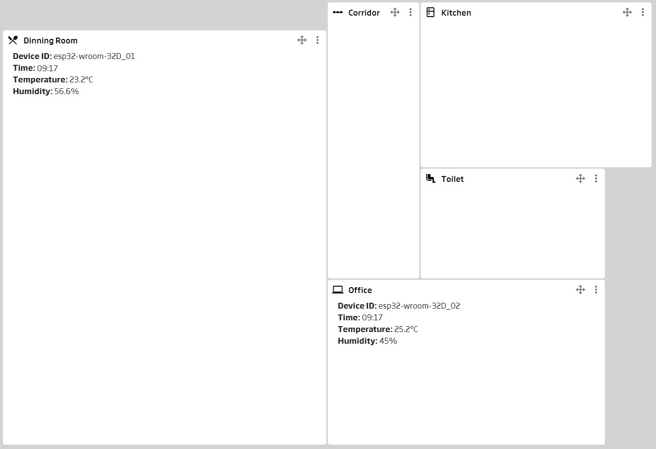
Now, each of you can decide what they want to show: Here each one can organize it as he wants; put the data in the centre of each room, put a clock about the update, modify the background colours according to thresholds of temperature, etc. These gadgets would also be of the «Template» type, so HTML + CSS + JS provide you with a world of possibilities.
Next we are going to move on to the second type of Gadget we wanted to create: the one with the temporal evolution.
This Gadget can be created from the Dashboard itself, or from the Gadget Manager. We are going to do it with the latter for the sake of change, so we will navigate to the Visualization and GIS > My Gadgets menu, and we will create a new one.
Here we will only have to choose a name for the Gadget, and the Ontology or Datasource with which we will feed it.
- Gadget Name: for this example I have used a name that is easy to identify: «arduinoDHT22_diningRoom_temperature_lastHour».
- Ontology or Datasource: here I have chosen the Datasource that we have created at the beginning, that of «arduinoDHT22_diningRoom_temperature_lastHour» (yes, same name as the Gadget).
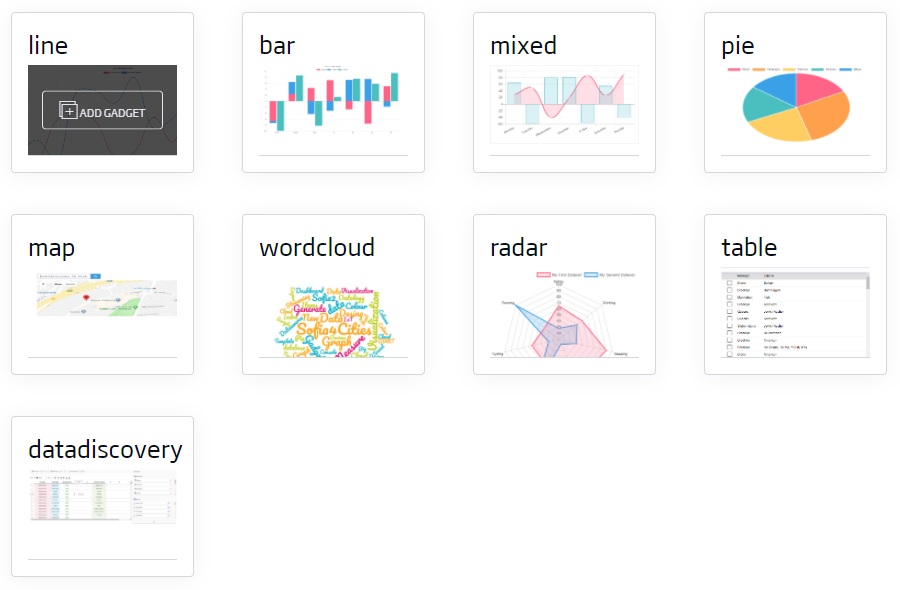
Once we have entered this data, we will have to choose the type of Gadget we want. From the different options, I have selected the «line» one.
Next, the Gadget configurator will appear. There, we will have to specify the parameters that it requests. The important thing here is to indicate that we want to show the time, the field «timestamp», on the X axis; and the value of the measurement, in this case the field «temperature», on the Y axis. Then we choose some colour that we like and the graph is ready.
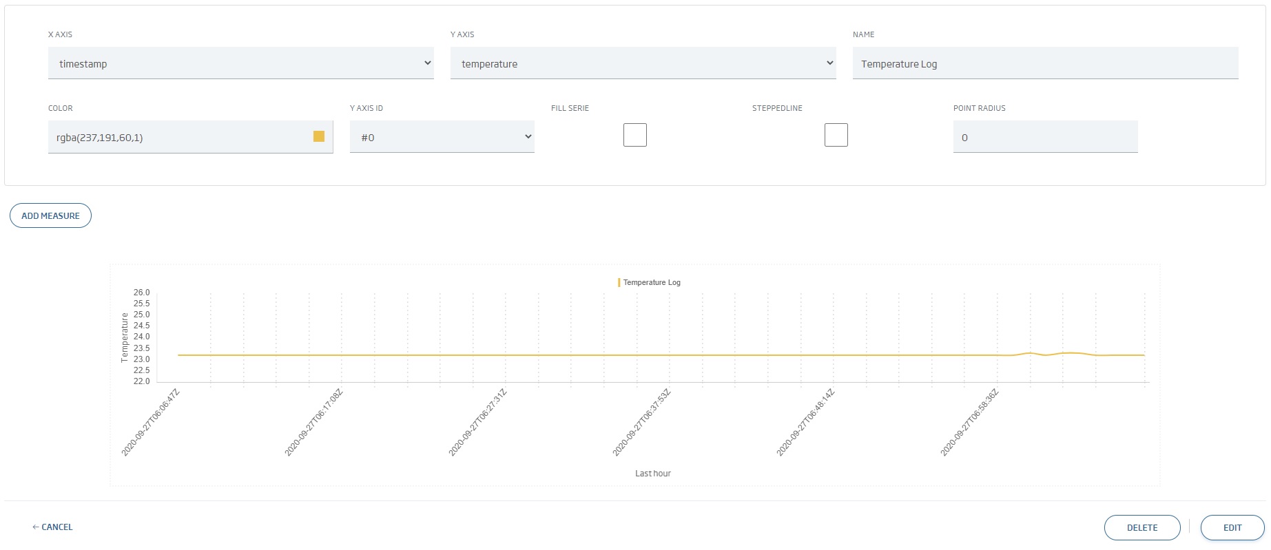
And that was it. Yes, seriously. We have succesfully created a time chart with the information of the last hour (or more precisely, of the last sixty records).
This graph corresponds to the room temperature, but you can also generate the humidity graph (in the same or a different Gadget), the graphs of another room if you have more than one sensor, etc.
Well, now we have completed this trilogy of how to connect an IoT sensor to the platform and how to represent it visually.
I hope you liked it, and if you have any questions, or you can’t do this, or you simply wanna say hello, just leave a comment. See you next time.


Pingback: Creating Ontologies from Time Series – Onesait Platform Blog