R Interpreter Tutorial for Apache Zeppelin
Taking advantage of the release of Onesait Platform version 7.0.0, three new tutorials on the different interpreters of Onesait Platform Notebooks have been generated.
In this post we are going to see the tutorial on the R interpreter for Apache Zeppelin.
Introduction
R is an open source environment for statistical computing and graphics.
Onesait Platform Notebooks include the R interpreter by default, so it is not necessary to install anything beforehand, and you only have to indicate the type of interpreter to use, as three are supported:
- %r.r: basic R interpreter, with the lowest number of dependencies. If only %r is used, the interpreter of %spark.r will be used if it is loaded.
- %r.ir: provides a more sophisticated execution of R through IRKernel, with a similar user experience to using R in Jupyter.
- %r.shiny: allows you to run Shiny applications.
Below are some examples of how to use R to calculate and represent results.
Examples of use
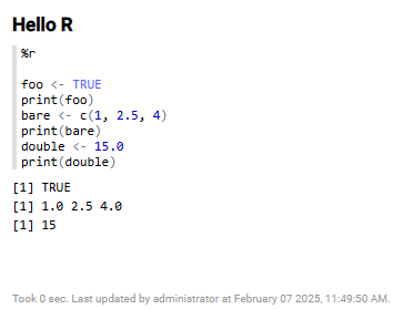
Hello World
The first example consists of displaying a few variables of different types in the results window. To do this, the following code will be written in a paragraph:
%r.r
foo <- TRUE
print(foo)
bare <- c(1, 2.5, 4)
print(bare)
double <- 15.0
print(double)
When the paragraph is executed, the result will be displayed.
Display tabulated data
It is possible to display information in tabular form, which allows a better visualisation of the data.
To do this, it is necessary to extend the capabilities of the interpreter by loading packages into the current session. Packages are collections of functions, data and documentation that extend the capabilities of R. These packages are loaded (not installed) via library(package).
Thus, to load the tables, the following code will be used:
%r

library(data.table)
An example of how to display a two-column table, with its headers, would be as follows:
%r

library(data.table)
dt <- data.table(Number=1:3, Value=4:6)
print(dt)
The result after executing the paragraph would show:

Show series of numbers
With R, you can perform all kinds of mathematical calculations. A simple one is to display dynamically calculated series of numbers, or ranges.
Take the following example:
%r

for (i in 1:5) {
  print(i*2)
}
print(1:50)
In this case, executing the paragraph will produce the following result:

Loading and interacting with Datasets
It is possible to load datasets in order to interact with them. We will take for example the ‘iris’ dataset, a dataset that comes integrated with R, and that contains information about iris flower species.
To display the data header of the dataset, the following code will be executed:
%r

colnames(iris)
After executing it, the fields that make up the header will be displayed:

In addition to the header, you can load fields and display their value.
%r

colnames(iris)
iris$Petal.Length
iris$Sepal.Length
The result would show the values of the ‘Petal’ and ‘Sepal’ fields:

Formatting the Output
We have already seen how to tabulate the data, but it is possible to format the output to make it more visual, and to add column management options.
To do this, we will use the cat operator. So, to display a two-column table with two records, we would use this code:
%r.ir

cat("%table name\tsize\nsmall\t100\nlarge\t1000")
The result would look like this:

%r.ir has been used instead of %r / %r.r to improve the display of table header fields.
Executing HTML code
It is also possible to enter HTML code and render it in the paragraph, again using the cat operator. In addition, it is possible to use logic for the data to be displayed.
In the following example you can see how title tags ‘H’ are added, as well as texts with CSS properties, use of font icons from CSS classes, all mixed with R logic:
%r

cat("%html <h3>¡Dile hola a HTML!</h3>")
cat("<font color='blue'><span class='fa fa-bars'> Texto de color azul</font></span>")

for (i in 1:10) {
  cat(paste0("<h4>", i, " * 2 <b>=</b> ", i*2, "</h4>"))
}
The result will be as follows:

Visualisation of graphs
There are also different ways to represent data in graphical form. One of them is using the Google Charts API (googleVis).
Examples include:
Bar chart
Defining a DataFrame with the values of coordinates and abscissae, as shown in the following code:
%r.ir

library(googleVis)
df=data.frame(country=c("USA", "Reino Unido", "Brasil"),
              val1=c(10,13,14),
              val2=c(23,12,26))
Bar <- gvisBarChart(df)
print(Bar, tag = 'chart')
The resulting graph will look like the following:

Candle diagrams
This type of diagram can be generated with the following code:
%r.ir

library(googleVis)

Candle <- gvisCandlestickChart(OpenClose,
                               options=list(legend='none'))

print(Candle, tag = 'chart')
The result is shown as follows:

Line chart
In a very similar way to the bar chart, a line chart can be generated with the following code:
%r.ir

library(googleVis)
df=data.frame(country=c("USA", "Reino Unido", "Brasil"),
              val1=c(10,13,14),
              val2=c(23,12,32))

Line <- gvisLineChart(df)

print(Line, tag = 'chart')
After running it, it will look like this:

Pair chart
To analyse the distribution of data, a pair chart can be drawn in a simple way. Thus, taking the data of the ‘iris’ set as a starting point:
%r.ir

pairs(iris)
The result would be:

It is possible to represent this graph with colour ranges by slightly modifying the code. Thus, for a range of three colours it would be specified as follows:
%r.ir

plot(iris, col = heat.colors(3))
The result would look like this:

Heat map
Another typical graphic that can be represented is the heat map. It can be generated using the following code:
%r.ir

library(ggplot2)
pres_rating <- data.frame(
  rating = as.numeric(presidents),
  year = as.numeric(floor(time(presidents))),
  quarter = as.numeric(cycle(presidents))
)
p <- ggplot(pres_rating, aes(x=year, y=quarter, fill=rating))
The generated map would look like this:

Bubble diagram
The information can also be visualised in the form of a bubble diagram. Taking the ‘fruits’ dataset, the diagram would be generated using the following code:
%r.ir

library(googleVis)
bubble <- gvisBubbleChart(Fruits, idvar="Fruit",
                          xvar="Sales", yvar="Expenses",
                          colorvar="Year", sizevar="Profit",
                          options=list(
                            hAxis='{minValue:75, maxValue:125}'))
print(bubble, tag = 'chart')
The result would be the following graph:

Maps
Last but not least, it is possible to display projected maps. To do so, the following code must be defined:
%r.ir

library(googleVis)
geo = gvisGeoChart(Exports, locationvar = "Country", colorvar="Profit", options=list(Projection = "kavrayskiy-vii"))
print(geo, tag = 'chart')
In the example shown, a map will then be displayed with the countries coloured according to the ‘exports’ dataset:

Conclusions
As can be seen, it is possible to interact with data in different ways using Notebooks with R. In the case of more advanced representations, using graphs and diagrams, the different APIs, such as the Google one used in this case, are useful and very practical.
This tutorial has tried to show basic representations as an example, so it is recommended to read the documentation of both R and the APIs that you want to use to be able to configure the available options in more detail.
Download example
The example used in this tutorial is available for download below: https://dev.onesaitplatform.com/download/attachments/4900651010/example_r_code.json
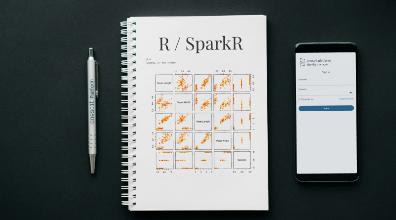
Header Image: dlxmedia.hu at Unsplash