Exploratory data analysis using Python and Pandas
Knowing the data with which we are going to work is a fundamental step in Data Science and, let’s face it, in almost any task that involves exploiting data in some way — from representing it on a map to a graphic representation of it. That is why Exploratory Data Analysis (EDA) is a critical process that consists of performing initial analyzes on the data to discover the existence of patterns, detect anomalies, test hypotheses and verify assumptions with the help of statistical summaries and graphical representations of the data.
In this post, we are going to learn how to analyze a set of flat data in CSV format (specifically, global temperature time series data) using Python, the most widely used programming language in the world today for data analysis, and one of its most interesting bookstores for these purposes: Pandas.
Data extraction from the CSV
The first step is to extract the data from the CSV file, which we will have downloaded at our location. To do this, we will create a new Python script like the following one:
# We import the Pandas library
import pandas as pd

# We find the CSV file
file_path = r'.\monthly_mean_global_temperatures.csv

# We generate the dataframe with the content of the CSV
temperatures_df = pd.read_csv(file_path)

# We show the content of the dataframe (CSV data) in the console
temperatures_df.info()
The output of this script will be something like this:
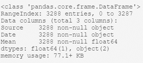
From here we can extract interesting high-level information, such as:
- The type of object that contains the dataset; the dataframe generated with Pandas.
- The total number of records in the archive: 3,288.
- A listing of the header attributes: their names (Source, Date, and Mean) and their types (object, object, and float64).
As we can see, with just a few lines of code we have been able to get an idea of what our data is like in general.
Record review
Once we know our data set at a macroscopic level, let’s take a closer look at some records, to gain more insight about said data. To do this, we are going to visualize the content of the first six registers, with all their attributes. We can do this with the following line of code:
# Show the first six records of the dataframe
temperatures_df.head(6)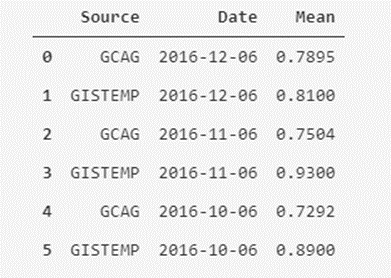
Ok, here we can see something interesting; In the Source column, we can see that there seems to be two different sources of measurement for the same value of the monthly average temperature (we see the repetition of dates two by two). Now, are we sure that there are only two types of sources? We can check that.
Collect unique values
Let’s analyze how many unique values are in the Source column. To do this, we have to keep in mind the exact name of the column; Source. We will execute the following script:
# We retrieve the unique values of the "Source" column
temperatures_df.Source.unique()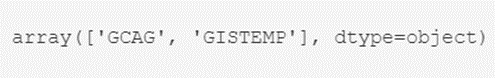
Well, we can rest easy mnow: There are only two types of values for the Sources field: GCAG and GISTEMP. Now, how many of each are there? We can hope that they are distributed equally, but are we sure about that?
To know for sure, we will execute another script that will return the number of records for each type:
# We find out the number of records by type in the "Source" column
temperatures_df.Source.value_counts()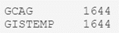
The result is as expected, so we can rest easy knowing that we only have a couple of types.
Once we have verified this, it is worth our time assessing what we want to do with these global temperature measurements. Whatever the objective (for example, making a prediction of future average temperatures), it seems logical to choose to separate the measurements of the two measurement sources into two different attributes, or to choose the average of the existing measurement systems for each month, or even a weighting between them if we have more information about each of these systems. Let’s see how.
Creation of masks
In this case, we are going to separate the measures of each source into two attributes. To perform such a filter, we are going to make use of a very useful concept in Python, called a mask (conceptually similar to a where filter in SQL).
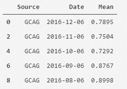
In the case of the mask for the GCAG type, this would be:
# The mask is created by filtering the Source column to those values that are GCAG
mask_GCAG = temperatures_df['Source'] == 'GCAG'
# A new dataframe is created from the created mask/filter
temperatures_df_GCAG = temperatures_df[mask_GCAG]
# Show the first five records of the dataframe (by default, if not indicated, five are shown)
temperatures_df_GCAG.head()
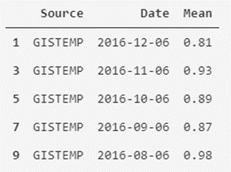
In the case of GISTEMP it would be something similar:
# The mask is created by filtering the Source column to those values that are GISTEMP
mask_GISTEMP = temperatures_df['Source'] == 'GISTEMP'
# Another new dataframe is created from the mask/filter created
temperatures_df_GISTEMP = temperatures_df[mask_GISTEMP]
# Show the first five records of the dataframe
temperatures_df_GISTEMP.head()
As we can see, it is easy to separate and filter our data. We can also create a new version of the data set that contains the average monthly temperatures of both measurement systems as attributes.
New pooled dataset
Starting from the new dataframes that we have created, we are going to generate the new dataset using the following script:
# We add the column named GCAG_month_mean_temp with the values of the mean of GCAC
temperatures_df['GCAG_month_mean_temp'] = temperatures_df_GCAG.Mean
# We add the column named GISTEMP_month_mean_temp with the values of the mean of GISTEMP
temperatures_df['GISTEMP_month_mean_temp'] = temperatures_df_GISTEMP.Mean
# We remove the Source and Mean columns
temperatures_df = temperatures_df.drop(['Source', 'Mean'], axis=1)
# We show the first five records of the modified dataframe
temperatures_df.head()
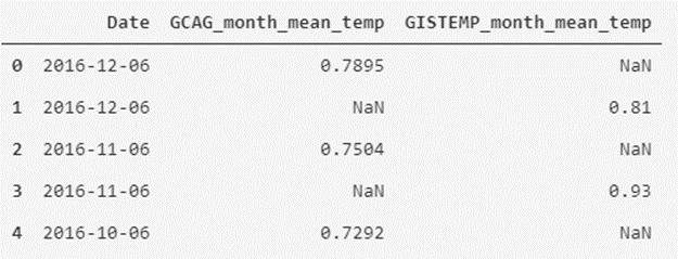
As we can see, we have remodeled the data table to another form that may seem more interesting to us to visualize the data.
We will now leave the format aside, and move on to analyze the data a bit; we will describe them.
Statistical Review
If we want to review the descriptive statistics of numeric attributes, we can use the describe() expression:
# We show the statistical information of the data
temperatures_df.describe()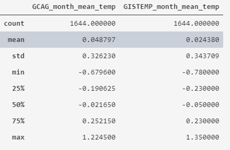
What we obtain is that the average value of the recorded historical temperatures is around 0º, varying between -0.78 and 1.35, also indicating its standard deviation and quartiles.
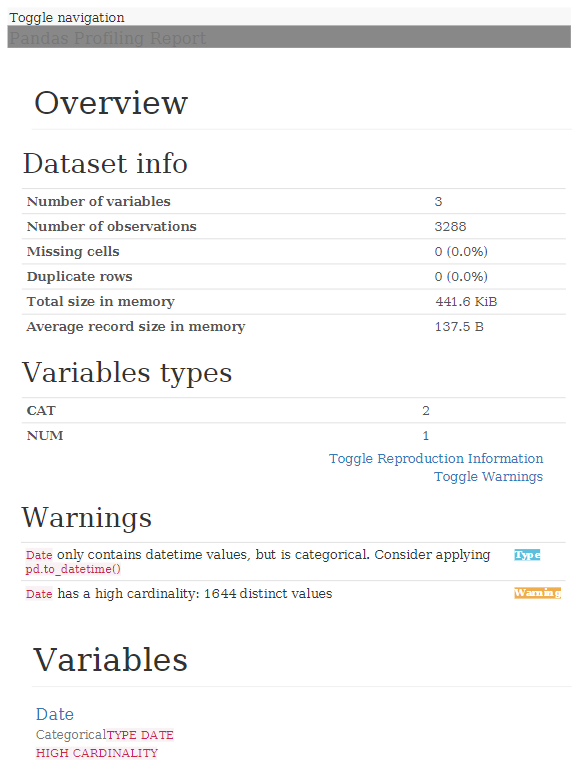
If we want to obtain a generic report with Pandas Profiling, which saves us much of the work we have to do in this phase, we can use the following script:
# We declare the function (to reuse it)
def profile_dataframe(dataframe):


  # We import the library
  from pandas_profiling import ProfileReport

  # We generate the dataframe report
  profile = ProfileReport(dataframe)

  # We export to HTML
  profile.to_file(outputfile="df_profiling_report.html")

  return

# We launch the function, adding the dataframe as an input parameter
profile_dataframe(temperatures_df)
With this, a report with all the information is generated in HTML format:
As we can see, analyzing a data file to get an idea of what data it contains, is quite quick and simple, providing us with valuable information once we start working knuckles down with the data.