Redesign and usability improvements in the Control Panel
We introduce you to the new features of the latest redesign of the Onesait Platform Control Panel. The usability team has carried out an analysis of the flows and screens to incorporate usability and accessibility improvements that enrich the user experience when interacting with the product. At the same time, aiming to achieve visual and functional coherence between elements, the visuals have been updated to V3 of the Onesait Design System (ODS), which was launched just this month.
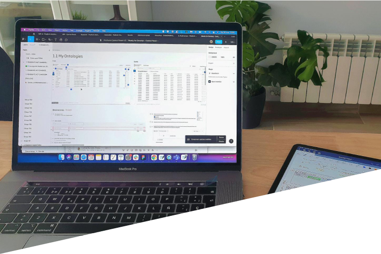
Within the complexity of the Control Panel, where each user role has access to different menu options, priority was given to the analysis of the Developer role, to identify which screens or flows are most important for the user or which are repeated in the console in order to identify mismatches and to achieve unification of both components and actions. The screens that were identified in this first phase of redesign are the Home, table screens, creation forms, editing, visualisation and the Query Tool.
General improvements to all screens – ODS V3
- Improved accessibility in colour palette, contrast and spacing.
- Adaptation of the typography by improving the typographic hierarchy and scale and inclusion of a new monospaced font for code and numeric indicators.
- Improved distribution and optimisation of the space that helps users to read by restructuring the layout of the elements on the screens and increasing the density of information.
- Changes in the Header and in the navigation menu.
Home
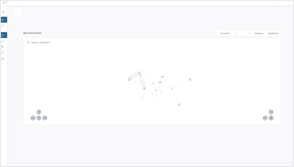
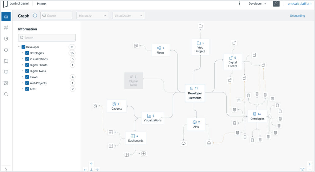
One of the problems that was detected in the old Home was the difficulty in navigating between levels because you could not know how many elements were included in each category; and, whenever an option including several options was opened, those overlapped each other in such a way that it was very difficult to distinguish the parents and children due to their visual similarity. The proposed changes are:
- Changes to the identification of graph elements and the quantity they encompass.
- Improvements in the visual hierarchy between parents and children.
- Search and filtering of elements.
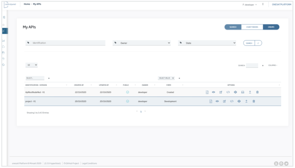
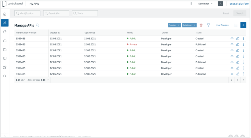
Tables
The table is the most repeated component throughout the Control Panel flows, as tables are used to visualise and execute actions on the different components to which each user has access. When analysing many of the table screens, we found several elements that did not keep a coherent line between them. The main goal has been to equalise the location of the actions, filters, pagination and search engines on all the screens to avoid inconsistencies and doubts in the actions carried out by the users. Other changes that have been made include :
- Optimisation of spaces, the margins that reduced the available visual space, have been eliminated to show more results by default in the table.
- Equalising search actions in all tables.
- Simplificaiton of actions and filtering, reducing the number of visible icons to the main actions and including the rest in an overflow icon.
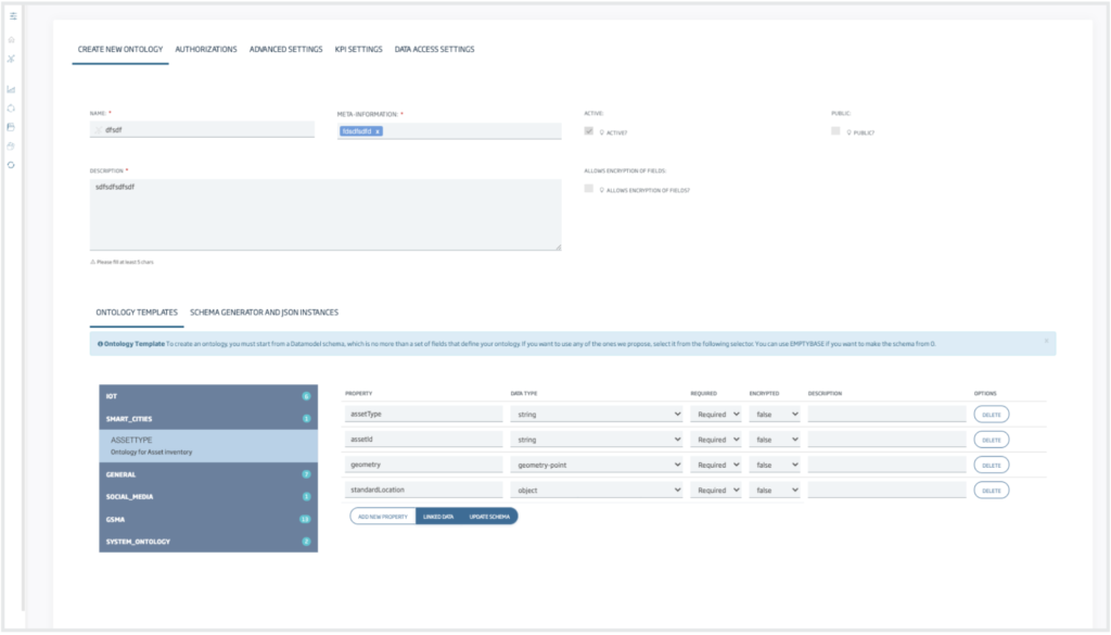
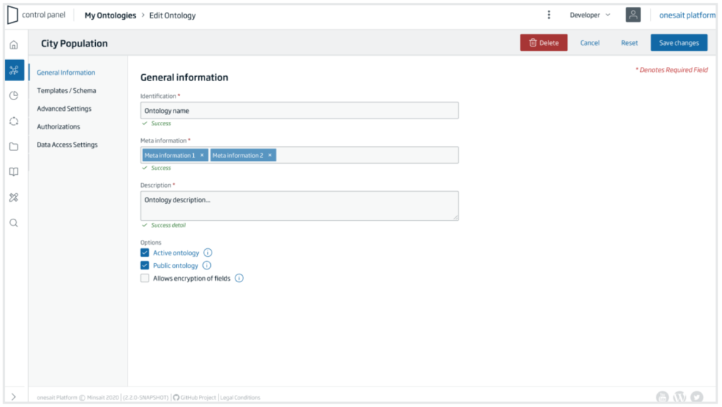
Step-by-step creation forms
Within the Ontology creation options, there are several options, among which the «Step by Step» option stands out. The changes made are:
- Reorganisation of information in the steps and inclusion of a wizard with steps to help the users.
- Linear reading of the information, changing the layout of the inputs and selectors to a single column to help reading the fields.
- Feedback on actions to the user, from the step they are at in the process, step blocking information, information icons, and success and error messages.
- Action buttons always accessible from the subheader on all screens.
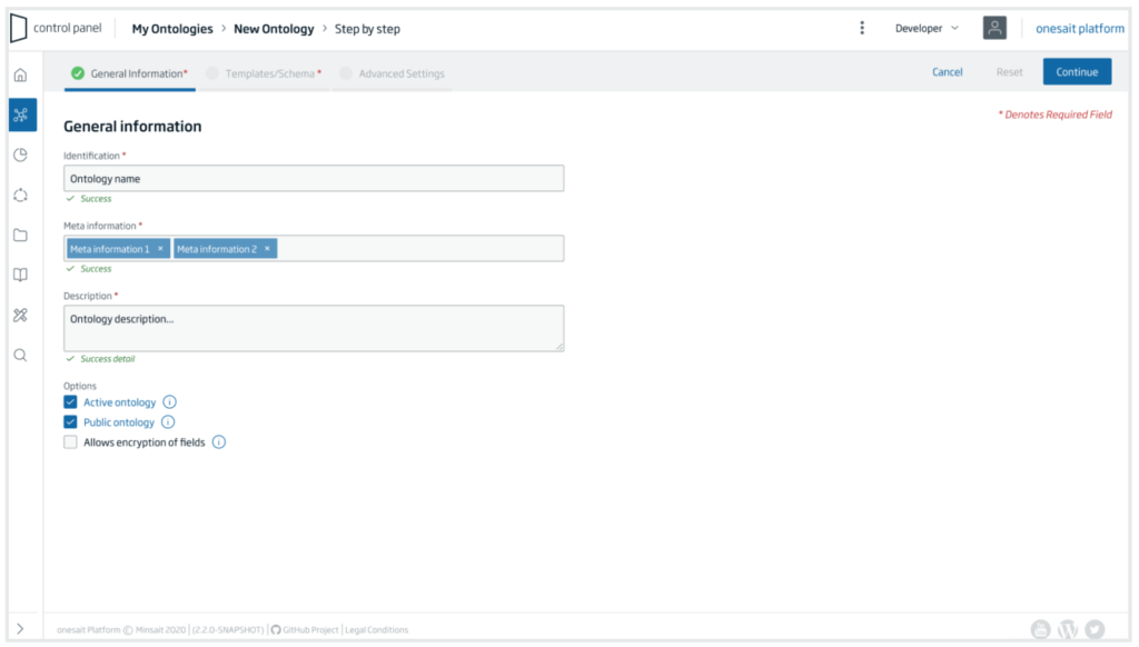
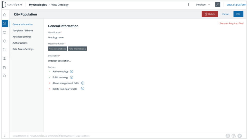
In the editing and visualisation mode, the navigation mode between sections is changed. As there is no order between the steps, a side panel with free navigation is used.
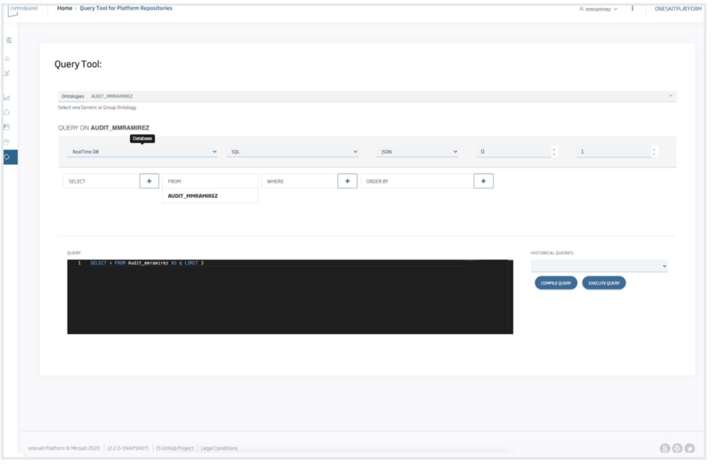
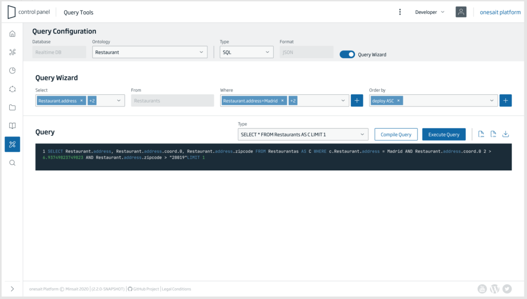
Query Tool
- Empty state.
- Reorganisation of the content.
- Static subheader with main configuration options.
- Optional user help wizard.
The presented changes are just the beginning of the redesign of the Control Panel, and in the next release we will bring you news. Meanwhile, we will continue working on improvements.
YouTube | Release 3.0.0 Feature – New ControlPanel UX