Extending the capabilities of Dashboards with JavaScript
Today we are bringing you an alternative to understand the native capabilities of the Onesait Platform Dashboard component.
An example of a use case could be the exploration of data related to the COVID-19 pandemic in Portugal. Today, many aspects of our lives are dominated by the consequences of that pandemic and, as in many other areas of activity, providing information in a simple manner, where the conclusions of the end users are easy to evaluate, is of vital importance.
Currently, we have a Dashboard with all this information, which is updated daily with the data provided by the Portuguese government and that you can check below:
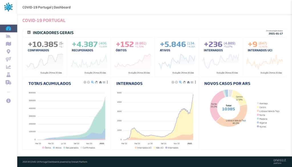
If you look at it, the design is a little different from what we usually have in Dashboards by default, since in this case we have use an external graphics library to make it even more attractive.
Throughout this post we tell you how to design and generate a graphics gadget using this graphics library step by step.
The idea
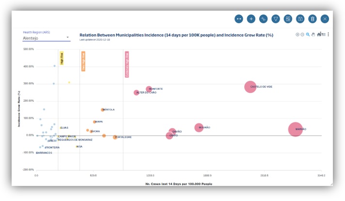
Confinement is the trending issue in many countries. In the case of Portugal, the aim is to measure it in terms of the number of people infected per 100,000 inhabitants in the last 14 days, an analysis which is carried out in every municipality, delimiting the levels of risk using this metric.
Therefore, we consider very relevant thahat every Portuguese person know the risk level of the area they are at – and thus know the limitations associated with that level – as well as what is their evolution and what is the level of comparative risk within that list.
It is thus an ideal use case for generating information graphs, since showing the information in table form is «staying halfway there», because you manage to lose the attention of the interested parties.
However, to obtain this type of graph, you must follow a path that implies that the data is in perfect conditions to be presented. For this reason, in the following diagram that we highlight what would be necessary to achieve this:
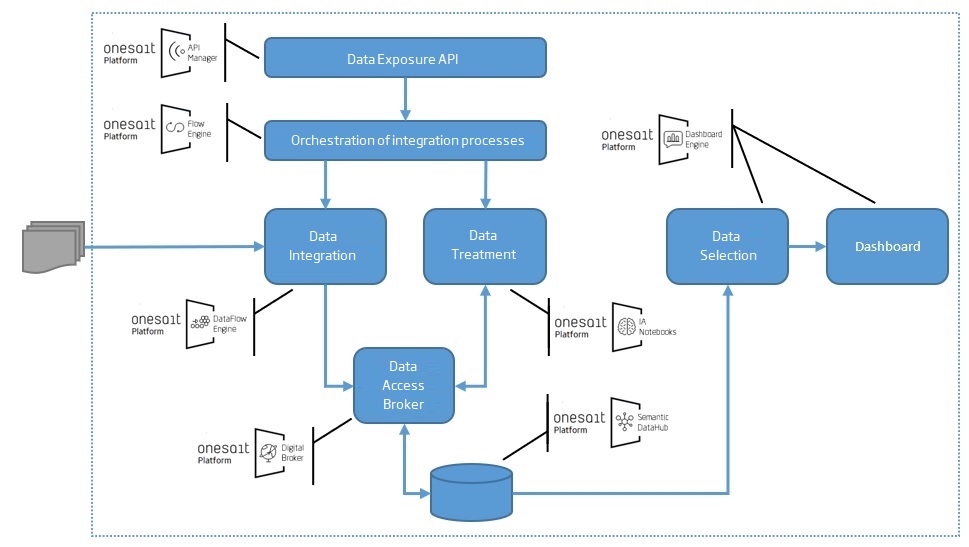
We are sure that this diagram not only responds to the purpose of this example, but it also shows many other needs that exist in the daily life of companies for digitalization processes. I dare say that it reflects the following:
- Onesait Platform responds to the need for the process completely, from start to finish.
- Each sub-process has a specific, specialised tool for each requirement.
- These tools, although integrated, are autonomous from each other, so they can be removed, replaced or extended without any problem, allowing an optimum adaptation to each process’ and client’s realities.
- For the example we suggest, all of this can be solved in a single process developed in a programming language. However, this would make it more difficult to implement, more complex to maintain and a real headache when it comes to scaling up in technical and functional terms.
The Onesait Platform provides all this (and more!) in one single platform and, in the simplest of situations, without requiring great programming knowledge, as we could say from the example we bring today.
This is because most of the tools that we are going to use have graphic interfaces to support their development, which allows for easy interpretation and mapping between the technology and its functional objective.
The design
Having understood all the global phases of the process, we will now focus on the final graphic to be produced which, due to the nature of the needs, has forced us to go a little further than the Platform’s native functionalities, making use of ApexCharts‘ Open Source JavaScript library. It is however important to highlight what is the result of the previous phases, and which of these serves as the input for the control panel creation.
Thus, first you would start by preparing the ontologies (concept underlying to the Semantic DataHub) with all the necessary data; that is to say, the collection of information by health region (ARS), municipality and date, detailing these dimensions for the new cases per 100,000 inhabitants in the last 14 days (incidence proportion), along with the variation since the last date.
Lastly, and as a result of a product weighted by various factors, you select the level of risk at each moment, a level previously calculated using a Notebook.
To prepare the data for its use in the charts, we create a DataSource (a conceptual tool of the Dashboards) named «DS_MINICIP_INCID», which carries out a SQL query on the interested ontology, and it is done in the following way
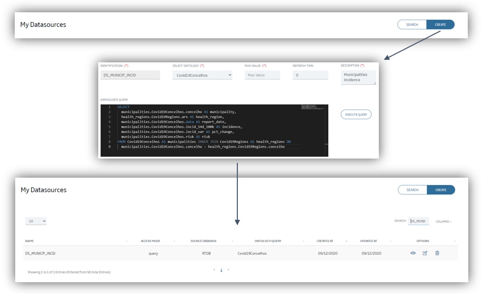
The answer of this DataSource can be consulted from this JSON file.
Then, the Dashboard is created from scratch, as described below:
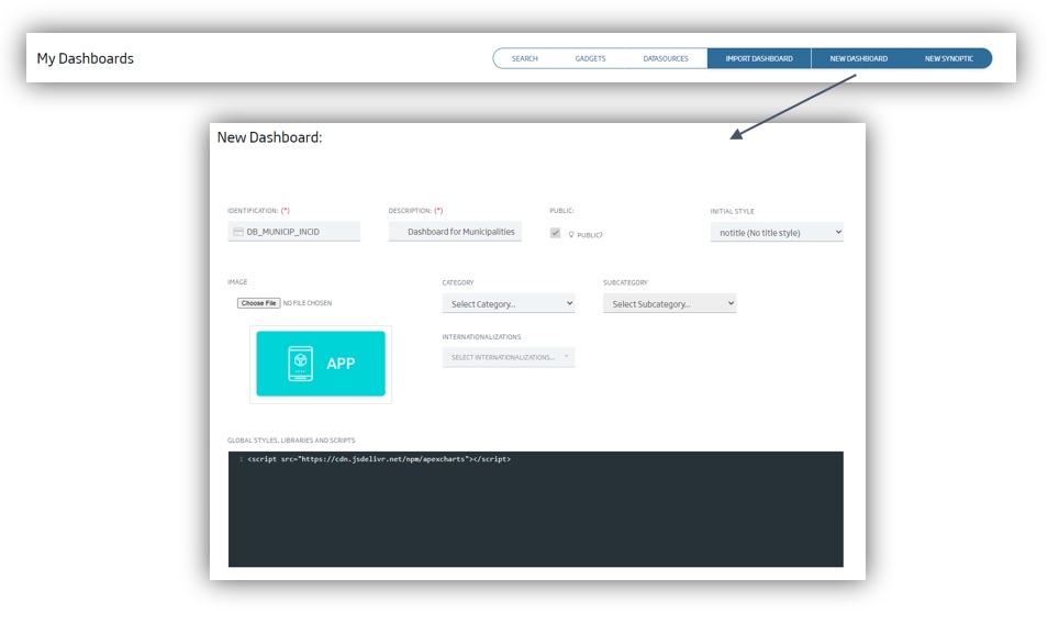
The initial configuration of the Dashboard must include the URL of the ApexCharts library. This can be done by adding the following line:
<script src = "https://cdn.jsdelivr.net/npm/apexcharts"> </script>Once the Dashboard has been created, it will be empty. Start by adding a Template-type Gadget and editing it following these steps:
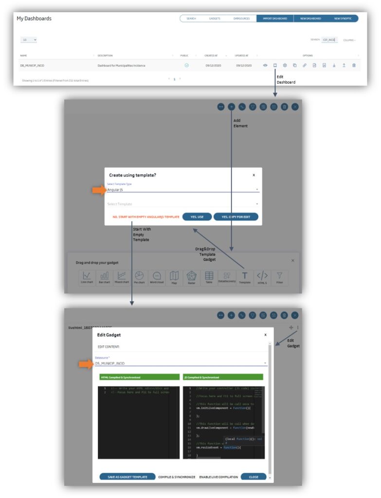
Two important points to consider are these:
- You must select «AngularJS» as the template type.
- As the DataSource, select the previously created one: «DS_MINICIP_INCID».
At this point, in the gadget configurator we have two editors available: one for HTML (to the left) and another one for JavaScript (to the right).
In the first editor, the HTML one, we define the following (we have included explanatory comments in the code to understand what is being done):
<!-- Styles to format the contents -->
<style>
  #chart1 {
    max-width: 100% auto;
  }

  md-card {
    box-shadow: none;
  }

  #title1 {
    padding-top: 0pt;
    padding-left: 10pt;
    color: #1A3B70;
    font-weight: bold;
    font-size: 12pt;
  }

  #subtitle1 {
    padding-top: 0pt;
    padding-left: 10pt;
    color: #1A3B70;
    font-size: x-small;
  }
</style>


<!-- Containers -->
<div layout="column">
  <div layout="row" layout-align="start center">
    <md-card>
      <md-card-content style="max-height:20;width:200">
        <md-input-container style="margin:0;padding:0;width:100%;">
          <label>Health Region (ARS)</label>

          <!--  The sendFilter function is responsible for applying the selected option as a data source filter, passing the value through the variable: 'ars' -->
          <md-select ng-model="c" placeholder="Choose Health Region"
            ng-change="sendFilter('ars',c)">

            <md-option value="Norte">Norte</md-option>
            <md-option value="Centro">Centro</md-option>
            <md-option value="Lisboa e Vale do Tejo" ng-selected="true">
              Lisboa e Vale do Tejo
            </md-option>
            <md-option value="Alentejo">Alentejo</md-option>
            <md-option value="Algarve">Algarve</md-option>
            <md-option value="Madeira">Madeira</md-option>
            <md-option value="Açores">Açores</md-option>
          </md-select>
        </md-input-container>
      </md-card-content>
    </md-card>
    <div>
      <label id="title1">
        Relation Between Municipalities Incidence (14 days per 100K people)
        and Incidence Grow Rate (%)
      </label>
      <br>

      <!-- The data source (ds) data can be accessed directly in HTML. Here we collect and present, in the graph's subtitle, the date of the first record (report_date) which, in this dataset, is the same in all records -->.
      <label id="subtitle1">Last update on {{ ds[0].report_date }}</label>

    </div>
  </div>
</div>

<!-- DIV container for the graphic. Its content will be generated with Javascript -->.
<div id="chart1"></div>
Next, we must prepare the JavaScript code that generates the graphic. The idea is to create a function designed exclusively to render the graphic using the ApexCharts library:
Seguidamente, es necesario preparar el código Javascript que genere el gráfico. La idea es crear una función diseñada exclusivamente para renderizar el gráfico utilizando la librería de ApexCharts:
/*
This function will receive, as a parameter, the data returned by the data source. The chart is defined by a JSON structure whose details can be seen in Apexcharts.
*/
function renderChart1(data) {
  chart1Optn = {
    /*
    This type of (bubble) chart allows for the presentation of data in 3 dimensions. This JSON structure node allows for the definition of the chart data. In this case, using a matrix of 3 elements: value of the X axis (incidence), value of the Y axis (pct_change) and value of the Z axis (risk).
    */
    series: [{
      name: data[0].health_region,
      data: data.map(n => ([n.incidence, n.pct_change, n.risk])),
    }],
    /*
    Here we define the chart's general properties: the type of chart (bubble), some aspects of representation, whether it shows the toolbar or not, and whether zoom support must be available or not.
    */
    chart: {
      type: 'bubble',
      height: '93%',
      offsetY: -10,
      toolbar: {
        show: true,
        offsetY: -54,
      },
      zoom: {
        type: 'xy',
        enabled: true,
        autoScaleYaxis: true
      },
    },
    /*
    This section defines the details of the chart representation: minimum and/or maximum size of these bubbles.
    */
    plotOptions: {
      bubble: {
        minBubbleRadius: 5,
      }
    },
    /*
    Definition of the description of each bubble In this case, the name of the municipality was chosen.
    */
    labels: [
      data.map(n => (n.municipality)),
    ],

    /*
    Here we define the colour of the bubbles. In this chart, we intend to make a dynamic definition, depending on the risk section, so we use a function that returns the colour (detailed below).
    */
    colors: [function ({ value, seriesIndex, dataPointIndex, w }) {
      return getColor(w.config.series[seriesIndex].data[dataPointIndex][0]);
    }],

    /*
    Definition of the details of representation of the description of each bubble.
    */
    dataLabels: {
      enabled: true,
      textAnchor: 'start',
      formatter: function (value, { seriesIndex, dataPointIndex, w }) {
        return w.config.labels[seriesIndex][dataPointIndex];
      },
      style: {
        fontSize: '10px',
        colors: ['#1A3B70'],
      },
    },

    /*
    The X-axis representation properties are defined here.
    */
    xaxis: {
      type: 'numeric',
      min: 0,
      max: Math.max(...data.map(n => (n.incidence))) * 1.1,
      labels: {
        style: {
          fontSize: '10px',
          fontFamily: 'Soho',
        },
        minHeight: 70,
        hideOverlappingLabels: false,
      },
      title: {
        text: 'Nr. Cases last 14 Days per 100.000 People',
      },
    },
    /*
    And here those of the Y-axis.
    */
    yaxis: {
      labels: {
        formatter: function (value, timestamp, index) {
          return value.toFixed(2) + '%';
        },
      },
      max: Math.abs(Math.max(...data.map(n => (n.pct_change)))) * 1.1,
      min: Math.abs(Math.min(...data.map(n => (n.pct_change)))) * -1.1,
      forceNiceScale: true,
      title: {
        text: 'Incidence Grow Rate (%)',
      },
    },
    /*
    Definition of bubble's filling colour properties.
    */
    fill: {
      opacity: 1,
    },

    /*
    Here we define the tooltip's properties for each bubble, configuring the information to be displayed and its labels.
    */
    tooltip: {
      enabled: true,
      x: {
        show: true,
        formatter: (n) => n.toFixed(2),
      },
      y: {
        formatter: (n) => n.toFixed(2) + '%',
        title: {
          formatter: (n) => 'Grow Rate:',
        },
      },
      z: {
        formatter: (n) => n.toFixed(2),
        title: 'Risk:',
      },
    },

    /*
    Here we define the annotations that can be added to the chart; that is, horizontal or vertical lines in specific values of the X and Y axes as reference. In this case, a horizontal line will be included in the 0 value for the Ys, to highlight the municipalities with positive and negative evolution.
    */
    annotations: {
      yaxis: [
        {
          y: 0,
          borderColor: '#000',
        }
      ],

    /*
    Now, a vertical line is generated in the 240 amount on the X-axis to make a separation between moderate risk and high risk municipalities...
    */
      xaxis: [
        {
          x: 240,
          borderColor: '#999',
          label: {
            show: true,
            text: 'High Risk',
            offsetX: 23,
            borderWidth: 0,
            style: {
              color: "#000",
              background: '#FFEA80',
            },
          },
        },
    /*
    ... another line, this one vertical, when X equals 480, to create a separation between high-risk and very high-risk municipalities ...
    */
        {
          x: 480,
          borderColor: '#999',
          label: {
            show: true,
            text: 'Very High Risk',
            offsetX: 23,
            borderWidth: 0,
            style: {
              color: "#fff",
              background: '#F7AC6F',
            },
          },
        },
    /*
    ... and a last line with a value of 960 on the X axis, to create a separation between very high-risk and extremely high-risk municipalities.
    */
        {
          x: 960,
          borderColor: '#999',
          label: {
            show: true,
            text: 'Extremely High Risk',
            offsetX: 23,
            borderWidth: 0,
            style: {
              color: "#fff",
              background: '#E88AA2',
            },
          },
        },
      ],
    },
  };
  /*
Lastly, we will generate the rendering of the chart (if it does not exist yet) or we will update it (if it exists).
  */
  if (chart1) {
    chart1.updateOptions(chart1Optn);
  } else {
    chart1 = new ApexCharts(document.querySelector("#chart1"), chart1Optn);
    chart1.render();
  };
};
Here we want to specify that we are using two global variables, which must be defined and initialized within the same JavaScript editor, as well as a function that returns the colour of the «bubbles» according to the value of the incidence:
/*
This variable stores the details of the chart with JSON structure.
*/
var chart1Optn = {};

/*
This other variable stores the object of the chart.
*/
var chart1 = undefined;

/*
This is the function that colours the bubbles in the chart according to the value of the incidence indicated as an input parameter.

*/
function getColor(value) {
    if (value >= 960) {
        return '#E88AA2';
    } else if (value >= 480) {
        return '#F7AC6F';
    } else if (value >= 240) {
        return '#FFEA80';
    } else {
        return '#B1CFE5';
    };
};
Besides, we will also use one of the functions that are available by default in the creation of the gadget template:
/*
The vm.drawLiveComponent function is automatically called whenever the data set coming from the DataSource is changed (e.g. as a result of applying a different value to the filter).
 This way, this function will be executed as soon as the Dashboard is created, and whenever a new option is selected from the drop-down list we created in the HTML structure.
 It also calls the graphic representation function (explained above) with the new data.
*/
vm.drawLiveComponent = function (newData, oldData) {
    if (newData) {
        renderChart1(newData);
    }
};
Having done all this, we save and compile the Gadget. Once this is done, we will create in the DataLink a connection between the option in the selected drop-down list and the data source, in order to automate the application of the filter:
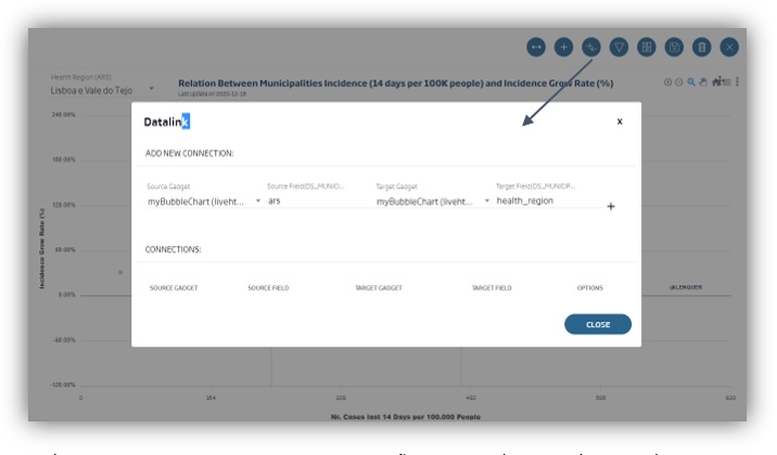
In this particular case, the source Gadget and the destination Gadget are the same (the Template Gadget we have created). We are also going to use, as our source field, the SendFilter function parameters used in the «ng-change» part of the HTML, and as destination field, the field of the data source to which the filter is applied:
- Source gadget: the name of the gadget in the source drop-down list.
- Source field: «ars».
- Target gadget: the name of the gadget in the target drop-down list.
- Target field: «health region».
Once this has been done, we should obtain a chart similar to the following one: